Facebook Event Email Subject Optimization

Everyone loves being invited to a friend’s birthday party on Facebook. Recently, I was invited to my friend Jane’s birthday party. Here’s what the email looked like in my inbox:

FB event 1

What was really effective at getting me engaged was that my friend’s name Jane Smith was in the from field of the email. This way, it appeared that she, personally, had sent me the email.

Shortly thereafter, I saw another email arrive in my inbox. My friend had updated the original invitation:

FB event 2

Now, instead of being from my friend, the email was from Facebook. So when I first glanced at the email in my inbox, I had less urgency to see what it was about because it didn’t appear to be arriving directly from my friend. My guess is that Facebook has AB tested the original event creation email subject and found that replacing Facebook with the event creator’s name in the From field leads to greater engagement. As a next step, they can either AB test the same change for the event update email or simply implement the change.

Advertisement

Improvement to FB Friend Confirmation Email

Noticed something strange when someone confirmed my Facebook friend request. In the email that Facebook sent notifying me of the friend confirmation, Facebook suggests some people who are connected to this new friend who I may also be friends with.

Image

This feature is useful and definitely makes sense given the context. However, when I click on the link of each user’s name, I am surprisingly not taken to that user’s profile page. However, I’m taken to a more generic page that has three modules: (1) open friend requests, (2) people I may know, and (3) a Search for Friends module.

Image

This is really strange and an unexpected user experience. Ideally, I’d be taken to the user’s profile which I clicked on — and there I can decide if I know that person and follow up with a friend request.

Bug in Facebook Friends of Friend Navigation (iOS app)

Noticed a bug while looking through my friend Joseph’s list of friends on Facebook.

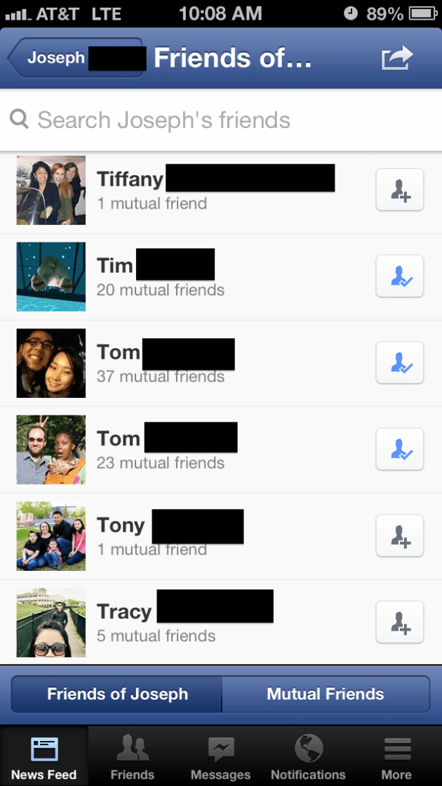
Here’s what I’m shown first when I go to browse his friends. As expected, I see his list of friends sorted alphabetically and I’m shown the friends at the top of that list.

Image
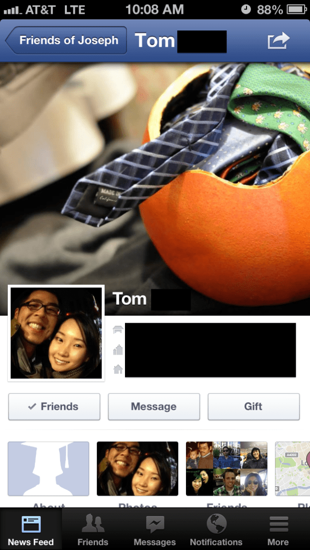
After scrolling through the list, I encounter one of my other good friends Tom:

Image
…and I click through to view his timeline:

Image
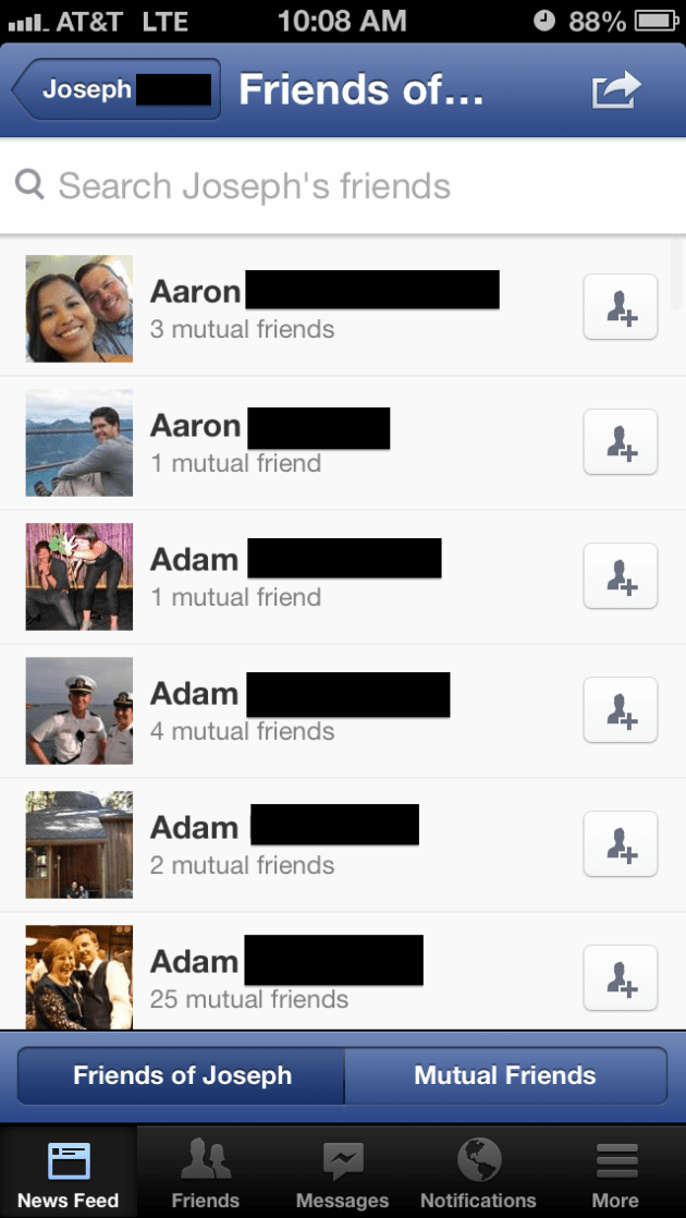
When I’m done viewing his timeline, I touched the “friends of Joseph” menu item in the top left section of the page. As a user, my expectation was to be taken back to Joseph’s friend list at the exat spot where I originally selected – namely the T’s where Tom’s name exist. However, I am taken back to the top of the list:

Image

Adding Social Share CTAs to ESPN Mobile Videos

Seems like everywhere you look these days, users are given an opportunity to share something via Facebook, Twitter, Google+, LinkedIn, Digg, StumbleUpon, and the list goes on an on. While it may be a bit overboard to offer sharing via so many different channels, offering sharing across Facebook and Twitter can be quite beneficial to a product.

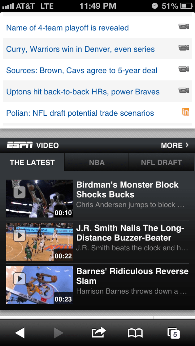
One area where sharing would be a logical fit would be across content sites such as espn.com. On their mobile site, they have a video module that typically had 3 videos that can be selected to be viewed.

Image


After clicking through, you are usually shown an ad and then the video.

Image


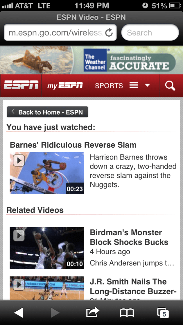
When the video concludes, you are taken to a video center page that shows you what video you just watched and asks you if you want to watch any more videos.

Image


At this point, this would be a GREAT opportunity for ESPN to offer the user the ability to share the video via Facebook or Twitter. This is no different than ESPN asking users to share articles via social channels. Except such a medium (video) may even have a more effective conversion rate of bringing new users back to the site.

FB iPhone App Bug: Search Doesn’t Remember What You Like

Noticed a strange bug when searching for a business page on the Facebook iPhone App. Even thought I had previously liked the business, the search results still displayed a hollowed out thumbs-up icon that indicates I have not yet liked the business. Here’s how to reproduce the bug.

1. Start with a Facebook Page you’ve already visited and liked. Search for this Page in the iPhone app:

Image

2. Just in case you haven’t liked it yet, double check, and press down on the empty thumbs-up icon to like the page again:

Image

3. Visit the page and confirm that you have liked the page:

Image

4. Touch the top level menu to search again. Here you will see your previous search query correctly displayed in the liked state:

Image

5. Then, clear out the search box:

Image

6. Finally, search for the same page again. Now, you will see the page displayed again, but it is displayed incorrectly as if it is not in the liked state.

Image

FB in iOS: Making Sharing More Prominent

Noticed a recent change in the latest FB iPhone App which was presumably done for the purpose of increasing user engagement with stories in the news feed. Before the change, here is how a sample story would look like:

Image

As shown above, the Like, Comment, and Share calls to action are displayed as simple word links. In addition, the number of likes and comments for the story are shown in a similar treatment with the same amount of prominence and with the same color. 

With the most recent iOS FB app update, here is how this component looks like:

ImageSo what changed?

– The biggest change is the change of word links as the primary CTAs (call to action) to using buttons with icons as the primary CTAs. This is a very huge and radical change. One well-accepted best-practise of conversion for site/app flows is the usage of buttons instead of text links and another best-practise is the usage of icons instead of just words. Here, Facebook is adding two very important components: both the conversion of the word to a button, and the addition of the corresponding CTA icon.

– In terms of overall screen real estate, the primary CTAs are taking up more space. Also, the component that conveys the amount of likes and comments has increased in size. Instead of showing the amount of likes and comments next to their corresponding icons, they are now shown next to the words Likes and Comments.

Is this a good idea? Will this feature succeed?

On the surface level, this is certainly not one of those cases where one design is obviously better than the other. Rather, FB will just simply A/B test this feature and see which design yields a higher level of engagement. What’s interesting about this before and after is that the before had a more prominent display of how previous users had engaged with this story (i.e. the amount of likes and comments) and thus this would increase the probability of the current user wanting to get involved and like or comment. And in contrast, the new design is leaning more toward making the primary CTAs more prominent and more appealing-to-be-clicked instead of relying on the social pressure of the statistics of the story.

An Enhancement to LinkedIn Connections of a Connection Pagination

I was browsing through the connections of one of my own connections on LinkedIn. In other words, this is the equivalent of going through a friend’s list of friends on Facebook. 

Here’s what I saw. I’ve blacked out the profiles that take up most of the screenshot, but the key part to observe is the numerical pagination at the bottom of the screen:

Image

What struck me about this design is that the pagination is not very intuitive. How on earth do I know what page 4 has, and what page 34 has? The whole purpose of including these various options for the user is to make it easier for the user to find what they are looking for. In this case, I would be much better served if there were links to alphabetical letters representing the different last names of my colleague’s connections. That would be an entirely more intuitive approach. 

Going back to the analogy of comparing this to Facebook friends of friends. That page is currently designed by using progressive loading of the page that eventually loads all of the friends of my friend. LinkedIn can use a similar approach (which they already do in their newer People You May Know page) or they can use alphabetical pagination for a more user friendly experience. 


Facebook iPhone App: Update Cover Photo Functionality Unclear

Recently, while I was going for a walk, I saw something really cool that I wanted to use as my new Facebook cover photo. I took a photo of it with my trusty iPhone and then went to my profile page in the Facebook iPhone App, ….., and then I was stuck. As far as I could tell, there was no way to update my cover photo directly from the iPhone App. I tried left swipe, right swipe, holding down on the cover photo, touching the cover photo, but to no avail…

Image

Here is what the profile page looks like in the web view. On mouse-hover, the user is presented with a Change Cover button in the bottom right corner of the current cover photo. Ideally, the iOS app should be modified to allow the user similar functionality. Possibly on touch of the picture, or hard press down, or even a tiny button in the bottom right corner in a similar manner as the web view.Image

Adding Work to FB Timeline Missing Social CTAs in Mobile View

Something small, but grabbed my attention nevertheless. Recently, I consumed the same Facebook update across both my web news feed and my mobile news feed. In this update, one of my friends added a place of employment to his timeline. What was interesting is that in the web news story, I had the ability to like or comment on this story. However, in the mobile news feed, I did not have the ability to like or comment on it. Most likely, this was a miss when implementing the same feature for the iPhone app. 

Web news feed view. I have the ability to like or comment. 
Image


Mobile app news feed view. I do not have the ability to like or comment. 
Image

Facebook iOS Ads May Span Entire Screen

Much has been said about how important it is for Facebook to successfully monetize in the mobile space. Advertising in an app is a double-edged sword that yields seemingly free money on the one side but may lead to long-term disengagement from users. At the end of the day, deciding on the amount of advertising in an app requires a very delicate balance to be maintained.

Today, I saw something in the Facebook iOS app that was definitely not balanced:

Image

In my opinion, this experience as bad for the end user for two reasons:

  1. The entire screen of the user’s view is taken up by ads
  2. This was the first thing that was shown upon entry into the app

In an ideal user experience, there would be some smarter logic that would spread out ads across the different news feed stories so that the user is never bombarded with so many ads at once that they don’t get anything resembling what they were looking for in the first place.