Fidelity Lost All of My Money

Fidelity account view (post login) during a site maintenance:

Image

Portfolio Total for the account is listed as $0.00

Image

Initially, this scared the daylights out of me – did I really make such poor investment decisions that lead to losing my entire portfolio?!?

Nope – just a false alarm. Better design would be to write “Not available” similar to the first page.

Advertisement

Great Read on Error Handling

As mentioned before, I’m very passionate about user experiences pertaining to error cases. How the error is handled, what is shared with the user and what is left out, how much technical jargon is used in the content, the length of the content, the graphics of the page (or part of the page) of the error message, and the list goes on. 

I found a great site (from an unlikely source!) that captures error messaging best practices

Image

Fun With 404s

In the wonderful world of the world wide web, there’s a type of page that’s called the 404 page. This is the page that is shown by the site if the web request sent by the client is not understood by the web server. For more practical purposes, this page is also the catch-all page that is shown to users when there is an internal fatal error that cannot be mapped to any helpful or specific messaging that would be useful to the user.

Typically, when the user arrives at this page, they were trying to do something on the site, but something went berserk in the back-end and was not handled gracefully. There is a manual way to reach this page as well. Here’s how you can do it.

1. Start with a site URL, such as http://www.google.com
2. Append a slash “/” and an arbitrary piece of text, such as “arbitrarytext”
3. Go to the newly formed URL: http://www.google.com/arbitrarytext

Here’s what you’ll see: (highlights added by me)
Image

Thoughts…

1. I like the page title “Error 404 (Not Found)!!1” as the exclamation marks and the “1” at the end (what you would press if you weren’t holding down the shift key and trying to type an exclamation mark) really convey the frustration of the situation.
2. I love the picture of the robot that has fallen apart – it brings humor to a situation that may have otherwise been a bad user experience.
3. I love the part that says “That’s all we know”. This piece of text stays true to the error guideline of telling the user what happened and why it happened. Here the application is admitting its ignorance!
4. Finally, I see one room for major improvement. A Google search bar should be dropped into this page with a helpful piece of text such as “Looking for something? Perhaps, a web search would help…” or some other content. This is the page where people become stuck – there’s no better way to un-stuck the user than Google search to look for what possibly went wrong. And this could be a decent revenue generator for Google as well.

Here are some creative versions of this page: http://www.hongkiat.com/blog/60-really-cool-and-creative-error-404-pages/

Chase Freedom Incentives & Making Rational Economic Choices

The Chase Freedom credit card has a promotion that gives users bonus cash back.

Here’s how it works:
– For a given quarter, you earn 5% on purchases in specific categories (such as at grocery stores and at movie theaters). You can earn this bonus rate of 5% on up to $1500 worth of purchases.
– For all other purchases, you earn 1%.

Let’s think about why a consumer would participate in something like this, and if it’s the rational economic choice. As a consumer, one would be reasonable to think: “Well, I already spend on these categories, so I might as well sign-up and earn the extra bonus cash back along the way. I’ve got nothing to lose.” So on the surface, the choice seems trivial. But on a deeper level, I think that’s where consumers end up not making the rational economic choice.

Assuming a consumer goes on to spend exactly $1500 in the quarter for the bonus categories, they will have thus earned $75 bonus cash back (5% of $1500). The essential question would be: which is more likely?
(a) Irrespective of this bonus offer, the consumer would have spent at least $1425 on these categories for the quarter.
(b) This incentive impacted multiple purchase decisions and caused the consumer to make multiple purchases as a result of the existence of the incentive whereas they would not have made the purchase otherwise. Specifically, without this incentive, they would have spent less than $1425 for the bonus categories.

For most consumers, I think (b) is more likely than (a). In other words, they would be best served carving out $75 (or more) of the $1500 and simply not spending that money in the first place, rather than making the spend and getting the money back.

Image

Image

An Enhancement to the LinkedIn Connection Confirmation Email

After someone accepts your connection request on LinkedIn, you are sent an automated confirmation email. In this email, you see a snippet of the user’s connections. These are people that you may already be connected to, or new people out of your network. 

When you click on the “connect” call to action for any of these users, you are taken to a page where you can submit a request to be connected with the user.

Here’s the part that doesn’t make sense to me. The part above the “connect” call to action where the user’s name and job headline is listed is also clickable. My expectation upon clicking on that part of the email was that I would be taken to that user’s public profile page – or their main page if I’m already connected to them. However, what happens is that I’m just taken to the same connection request page. This doesn’t make much sense to me as what I really wanted to do was to learn more about this person – and not to submit a connection request. And, the connection request functionality already exists with the “connect” link. 

If I were to enhance this email, I’d lead two outgoing links from this module. One to request connection as it already exists, and one to take you to the user’s public profile page. That would be the more intuitive user experience. 

Image

A New Feature for the iPhone Clock Alarm

Just like the majority of working folks, I use an alarm to wake up every morning Monday through Friday. And just like a huge chunk of those folks, I use the iPhone clock alarm to get my attention and summon me out of bed. There is one aspect of this daily routine that is unnecessarily annoying.

Let’s say I have two alarms. The second one scheduled as a back-up in case the first one doesn’t wake me up. Or in case I wake up and (in an act of self-sabotage) I instinctively turn off the first alarm and go back to bed.

Similar to many people out there, my body has trained itself to wake up 5 or 10 minutes right before my initial alarm goes up. Basically, it’s gotten used to the routine so it just wakes up itself -instead of being prompted. So at this point, I’m awake and ready to get ready for work. But, I have two active alarms that haven’t been triggered yet. If I do nothing to the alarms and go and take a shower, the phone will start to make it’s LOUD alarm sounds while I’m gone. This could be a distraction and an annoyance to anyone nearby who is (lucky for them!) still sleeping. So why don’t I just turn OFF the alarms? Well, because if I turn them off, then I have to turn them on again every day to be prepared for the next day. This completely defeats the purpose of having a recurring alarm notification.

I propose a new feature. We can call it a one-time-snooze, or a one-time-OFF, or maybe we can come up with the name later. But how it would work would be: for a given alarm notification, the user can request that the application forgo the immediate upcoming alarm reminder. That way, I can go off and get ready, the phone will not sound an alarm for the morning, but it will be ready to do so the next morning!

Dieter Rams: The Steve Jobs before there was a Steve Jobs

A couple months ago, I saw an exhibition on Dieter Rams at the SF Moma. Dieter Rams is a designer widely known for the products he designed for Braun. This guy blew me away. His products immediately reminded me of Apple products in the sense that they were simple, elegant, and very intuitive. Yet his designs came decades before the modern day Apple products we all know and love. 

Dieter Rams created the Ten Principles of Good Design. To me, having a deep understanding of these principles is crucial for any web designer, app designer, and most of all for any product manager or CEO. 

Taken from the wikipedia page on Dieter Rams

Good design:

1. Is innovative: The possibilities for innovation are not, by any means, exhausted. Technological development is always offering new opportunities for innovative design. But innovative design always develops in tandem with innovative technology, and can never be an end in itself.

2. Makes a product useful: A product is bought to be used. It has to satisfy certain criteria, not only functional, but also psychological and aesthetic. Good design emphasizes the usefulness of a product whilst disregarding anything that could possibly detract from it.

3. Is aesthetic: The aesthetic quality of a product is integral to its usefulness because products are used every day and have an effect on people and their well-being. Only well-executed objects can be beautiful.

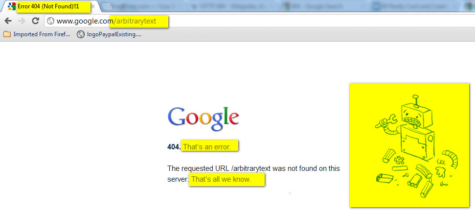
4. Makes a product understandable: It clarifies the product’s structure. Better still, it can make the product clearly express its function by making use of the user’s intuition. At best, it is self-explanatory.

5. Is unobtrusive: Products fulfilling a purpose are like tools. They are neither decorative objects nor works of art. Their design should therefore be both neutral and restrained, to leave room for the user’s self-expression.

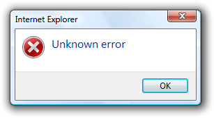
6. Is honest – It does not make a product more innovative, powerful or valuable than it really is. It does not attempt to manipulate the consumer with promises that cannot be kept.

7. Is long-lasting – It avoids being fashionable and therefore never appears antiquated. Unlike fashionable design, it lasts many years – even in today’s throwaway society.

8. Is thorough down to the last detail – Nothing must be arbitrary or left to chance. Care and accuracy in the design process show respect towards the consumer.

9. Is environmentally friendly – Design makes an important contribution to the preservation of the environment. It conserves resources and minimizes physical and visual pollution throughout the lifecycle of the product.

10. Is as little design as possible – Less, but better – because it concentrates on the essential aspects, and the products are not burdened with non-essentials. Back to purity, back to simplicity.

Yelp User Photos: Mobile vs. Web

As mobile/tablet user experiences become more widely used versus their (archeological) non-mobile/tablet web counterparts, there may be a divergence of functionality for the same feature on the same site for the different platforms.

Consider Yelp user profiles and the corresponding user photos. In the iPhone Yelp App, I can browse to the user’s profile page and view all of their photos without being a Yelp member:

Image

However, when I try to do the same on my laptop, I see the following:

Image

Image

Here, Yelp is asking me to log into my account, or register as a new user in order to view this user’s photos. Not sure if Yelp is making this distinction between iPhone and WebApp on purpose or if this is a bug, but let’s assume it’s on purpose. They may be making the bet that users are more willing to register and/or login in the non-mobile web flow as compared to the iPhone App flow. Why? Most likely, the user has a keyboard in front of them and can get to the next step more quickly than using their touchscreen device to login or worse, register for a new site. It’s an interesting strategy, but one that will may yield a drop-off in logins or registrations as users flock from their computers to smart phones and tablets.

A (rare) Complaint About the iPhone

One surprising “feature”, for me, about the iPhone is that a password character is visibly displayed for a short amount of time before being hidden. The motivation behind this feature being that people are less used to typing passwords into mobile touchscreen devices. And since these passwords need to be 100% accurate (and there’s no nifty iOS auto-correct to save the day), the user is given assistance by showing, for a brief period of time, what they typed in. 

Here’s an example:

Image

I understand the motivation behind this functionality. What I don’t get is why there isn’t an option in the user settings in order to override this type of behavior. If I am willing to forego the extra added convenience of being able to type in the password and willing to trade it for the extra added security for someone looking over my shoulder, why shouldn’t I have this choice? 

The funny thing is that Apple itself doesn’t follow this pattern with respect to the iPhone unlock view. The numerical inputs are always hidden and never briefly lag on the screen for anyone to see:

Image

Gmail Send Button: Compose vs. Reply

I don’t know if this is a bug or a feature, but the “Send” button in Gmail looks different for the following two use cases: (1) composing a new email thread and (2) replying to an existing email thread. 

The key difference (which is obvious) is that the button is a solid red color. The other subtle difference is that the underlying text is all caps for the compose use case. 

I’m fairly certain this is a feature (and not a bug) and the reasoning behind this would be to bring even more attention to the call to action in the compose use case as compared to the reply use case. At first I thought this may be due to Gmail wanting to prevent users from drafting messages and “losing” them due to not sending, but I realized Gmail already has a nifty auto-draft-save feature that will save your composed or replied draft automatically. Either way, you’re not likely to type something up, close your browser, and lose it forever. Perhaps, the difference they’re trying to call out is that an email user has more to lose by not sending out an original message (and being delayed on that front) than not replying to an existing thread (and being delayed on that front). 

Compose:

Image

Reply:

Image