Bug in Gmail Message Time?

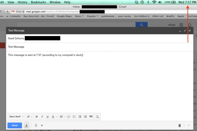
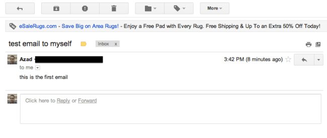
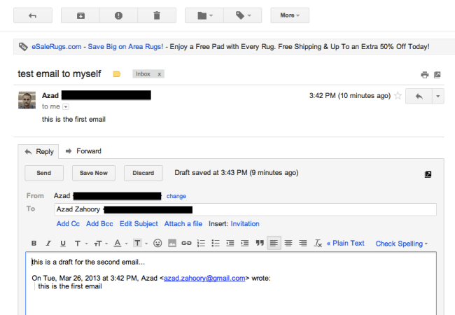
Every so often I come across a user experience that is most likely a bug but could also possibly be by design. Here’s a good example. I often write myself emails through Gmail to serve as future reminders. Essentially overloading e-mail and leveraging it as a todo list. After sending myself an email from my laptop this evening, I noticed that Gmail told me that I sent the email 3 minutes ago – even though I had just sent the email. After some investigation, I saw that Gmail uses two different data sources to figure out when an email was written and how long ago it was written. Let’s take a look with a sample email: 

Image

Image

As can be seen in the second image above, 7:54 PM is based on the actual and correct time (according to Google’s servers) as to when the email was written. “3 minutes ago” turns out to be based on my computer’s internal clock. This can be easily reproduced by opening up the settings in OS X and changing the computer time to some time different than the correct time. 

Advertisement

A Tactic to get Past the new Gmail Promotions Tab

Not too long ago, Gmail rolled out a new Inbox with customizable tabs which include notification emails from Social channels as well as a tab for Promotional emails. Some speculate that this new design may be a huge headache for marketers as it becomes even more challenging to get eyeballs on the emails that they send out.

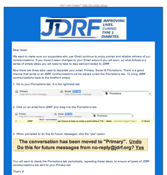
I saw an interesting tactic to get past this challenge. In a fundraising email I received from JDRF, I was instructed to train Gmail to send emails from JDRF straight to the Primary tab instead of the Promotions tab.

Image

Image

By dragging the email from the Promotions tab to the Primary tab of my Inbox, I have the opportunity to create a rule to filter future messages from JDRF straight to the Primary tab of my inbox and thus increase the chances that I consume emails from JDRF.

One could argue that this tactic is simply a modern day parallel of the already existing “add our email to your contact list so that future emails are not marked as spam” email technique. It’ll be interesting to see if other products employ similar tactics to optimize their performance for Gmail users.

Gmail Move to Inbox Glitch

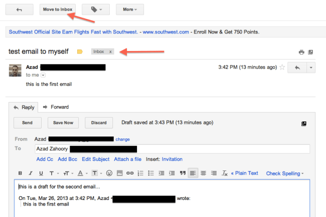
Found an tiny glitch in Gmail. When you access a draft reply of an email conversation already inside your inbox via the Drafts folder, Gmail incorrectly offers you the call to action to move the conversation to the inbox. Let’s take a look: 

1. Start with an email that is part of a Gmail thread that currently resides in your Inbox. As you can see, the top level CTAs offer you to archive the thread, mark it as spam, and send it to the trash, along with some other CTAs as well. 

Image

2. Click on Reply to start a reply thread. The top level CTAs remain the same. 

Image


3. After the web app auto-saves your draft, wonder over to the left side-bar menu and click on the Drafts link. From here, find your draft reply and click and open the thread. 

Image


4. Here’s the interesting part. Instead of having the same top level CTAs as before (archive, spam, and trash), now the user is given the option to move the thread to the inbox. This is a bit strange as the thread is already in the Inbox. Ideally, Gmail should correctly differentiate between threads currently in and out of the Inbox and offer the correct top-level CTAs. 

Image


Gmail “Report Spam” Missing Bulk Functionality

Here’s another case of missing product functionality that may be due to a bug or by design. When going through some of my emails in Gmail, I noticed something interesting with how the Report spam feature works when multiple emails are selected. Let’s take a look. 

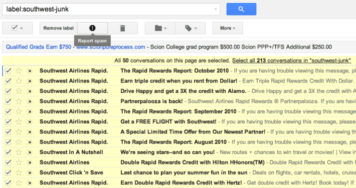
Here’s a search for all emails that have the label designated as southwest-junk:

Image

And here’s the view after all of the emails on the first page of search results are selected: 

Image

At this point, on mouse-hover over the Report spam button, the button appears as enabled and there is a tooltip text that highlights the functionality. The interesting thing, is that this functionality is not available when all 213 emails in the search set are selected. 

Image

In the view above, the Report spam button is disabled and the user is not able to report all messages in the search set as spam. While this doesn’t strike me as missing functionality that would be super important to a user, it is a bit arbitrary to allow the user to mark 50 messages as spam, but not 213. Perhaps it was a performance optimization decision – or perhaps a product call. 


Gmail Shipping Assistant Too Eager To Help

Gmail has a neat feature that lets you check the latest status of a package that is being delivered to you.

Here’s how it works. If Gmail can detect in the body of an email that a package is being sent to you and the email contains a tracking ID, then a module will be created in the right rail that has a link to the shipping carrier’s website displaying the latest status of the package.

Unfortunately, this feature has a tendency to pop up even if the email has nothing to do with a package begin sent. Below, I will show an example of this feature working correctly, as well as an example where the feature show up incorrectly.

Working as expected:

Image

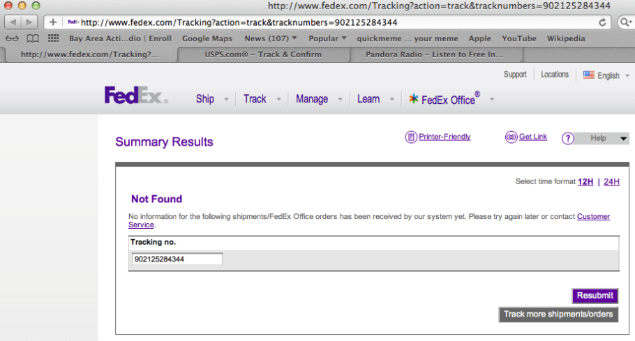
When you click on the track package link in the right rail, you will see something like:

Image

And here is an example of a false positive where a link is incorrectly shown in the right rail when the content of the email has nothing to do with a package being sent:

Image

Image

In the email above, Gmail is incorrectly interpreting a phone number as a package tracking ID. Also, the body of the mail mentions nothing about a package being sent. Ideally, Gmail can get a bit “smarter” in terms of how they determine if a package is being sent. Some possible ideas to decrease false positives:

– Follow the created link to the shipping carrier’s site and see if it is an invalid package ID
– Check the sender’s email address and match it to a common list of emails that relate to packages being sent i.e. @ebay.com and @amazon.com
– Search for certain key words i.e.: “shipping”, “package”, and “tracking”

Gmail Compose Button: Compose vs. Reply

In an earlier post, I wrote about the Gmail Send button and its different color treatments for two use cases. In this post, I take a look at the Gmail Compose button for the two key use cases: (1) composing a new email and (2) replying to an existing thread. 

Here’s what the Compose button looks like in its default state – when the user signs into Gmail. It is a very bold red color and it clearly is the main call to action for the user. 

Image

Here’s what the Compose button looks like when you are sending a new message. The Compose button is no longer a bold red color — it simply has a plain very light gray background. The main call to action is the Send button. This makes sense. As a user, if you’ve entered the flow to create a new message, your next logical step is to send the message, not to compose a new message before sending the one you just worked on. 

Image

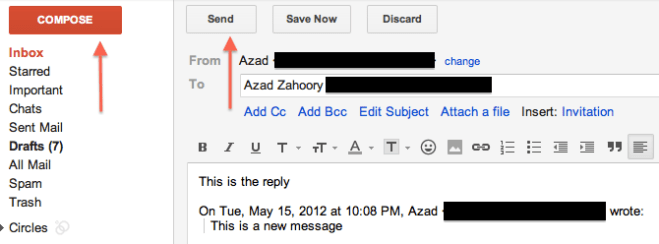
Here’s when things start to get a little strange. This is what the user experience looks like when you are replying to an active email thread. In other words, you are not creating a new email thread:

Image

In the image above, the Compose button is once again bold and red and the main call to action. The Send button has been relegated to back-up status and has the plain light gray background. I’m not sure it makes sense to not have the main call to action be for the user to send their reply. Why would you want the user to enter this flow and then take their attention away from completing the email and sending away? The better user experience would be to treat the Compose button the same for both new messages and replying to existing threads. Specifically, the Send button should be the main call to action and the Compose button should be the secondary call to action with a light gray background. 

Gmail Send Button: Compose vs. Reply

I don’t know if this is a bug or a feature, but the “Send” button in Gmail looks different for the following two use cases: (1) composing a new email thread and (2) replying to an existing email thread. 

The key difference (which is obvious) is that the button is a solid red color. The other subtle difference is that the underlying text is all caps for the compose use case. 

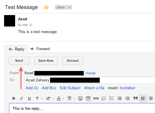
I’m fairly certain this is a feature (and not a bug) and the reasoning behind this would be to bring even more attention to the call to action in the compose use case as compared to the reply use case. At first I thought this may be due to Gmail wanting to prevent users from drafting messages and “losing” them due to not sending, but I realized Gmail already has a nifty auto-draft-save feature that will save your composed or replied draft automatically. Either way, you’re not likely to type something up, close your browser, and lose it forever. Perhaps, the difference they’re trying to call out is that an email user has more to lose by not sending out an original message (and being delayed on that front) than not replying to an existing thread (and being delayed on that front). 

Compose:

Image

Reply:

Image

Sign Out Pages

I did a mini-discovery of the “Sign Out” pages of some of the sites I often visit. This is the page the user sees after deciding to “Sign Out” or “Log Off”. The main purpose users perform this action is so that other subsequent users of the same computer do not have access to the original user’s personal and/or financial information.

First, I found it interesting that, from what I could tell, there are two naming terminologies to choose from for a site. Sign In / Sign Out and Log In / Log Out. I think I like Sign In / Sign Out more, but lets move on to the more important stuff..

For the site itself, the main purpose of the page can be to:

  • Give the user the ability to immediately enter the site again (Sign-In functionality on the Sign-Out page)
  • Take this opportunity to merchandise something to the user
  • Give the user a confirmation that they have indeed subsequently signed out

Let’s take a look at some examples.

WordPress, Facebook, and YouTube took the novel path of redirecting the user straight back to their homepages (this is why I haven’t provided any screenshots).

Chase communicates to the user that they have successfully logged off. I find it funny that they included the date too – not sure what the importance of this is for the user.

Image

Gmail uses this page to merchandise the service (Gmail) to the user. Not sure why they would do this as the user is already a user – maybe to garner even more loyalty? Also, Gmail has a button that the user can press to go back to the homepage to sign in again. I don’t like this approach as I don’t think this page adds anything that the Gmail homepage doesn’t already have. In fact, it doesn’t even have a sign-out confirmation message. All it does is add more more unnecessary step for the user to sign-in again.

Image

Twitter both confirms the sign out and takes a moment to encourage the user to use Twitter on a different platform i.e. Mobile. I wonder what their mobile sign-out page looks like. Maybe they encourage their users to try Twitter on a tablet or a “normal” computer?

Image

Finally, I saved the most interesting one for last. As an Amazon user, it is NOT possible to sign-out! Well, actually, this isn’t entirely true. It’s just that there is no explicit sign-out link. The user only sees two links referring to not being the user that is currently signed in. As a user, I find this annoying and confusing. Why can’t I sign out? Obviously, they do this in order to keep people from signing out.

Image

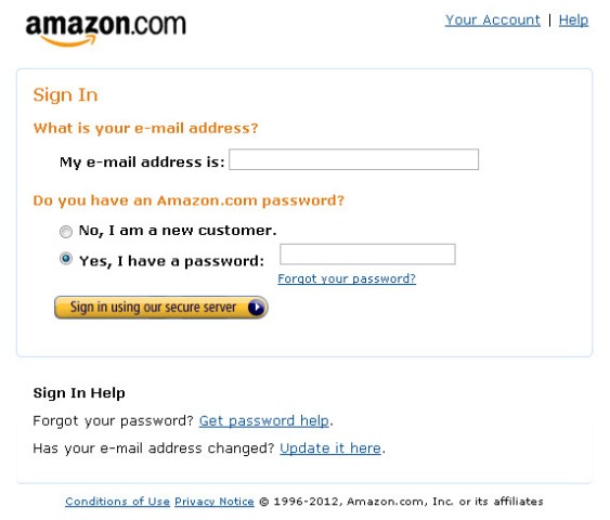
But the reality is, both of these links are in fact sign out links. By clicking on either of the “not so and so” links, you are taken to this sign-in page, and if you click back or go to the Amazon homepage, the original user is no longer signed in. Clever…but possibly annoying.
Image