An Improvement to Kindle on iOS

Noticed something confusing as I was reading a book on my Kindle app on my iPhone. Even though I was on page 229 of 263, the bottom of the app said that I was only done with 64% of the book. I did the math and confirmed that, according to my page position, I was actually done with 87% of the book. 

Image

Was this a bug? Well, not so fast. The other data point being displayed is location. And according to that metric, I was at location 3946 of 6164, which turns out to be 64%. Based on what I can see, it looks like the key difference between page numbers and location is that page numbers start and stop based on the actual book content while location includes everything — even the table of contents as well as the acknowledgments and index at the end of the book. 

As a user, when I see the % complete statistic, what I really care about is how far I’ve come so far, and how much longer I need to go to finish the book. Thus, this metric should be based off of the page percentage and not the location percentage. 


Advertisement

Amazon iPhone App Missing Sales Rank That is Available in Mobile Web

Discovered another case of a disparity between a product’s iPhone app and the same product’s Safari mobile web app on the iPhone. I was browsing for some books on the Amazon iPhone app and was curious to see what the Amazon Sales Rank of a particular book was. Everywhere I looked in the product description, I was surprised to see that I could not find it. So I turned to the mobile web app to see if it existed there. Lo and behold, I found the sales rank in the product details section of the mobile web app product page:

Image

Then I returned to the iPhone app to see if I could find it in the same section. Surprisingly, I found the same section with all of the same pieces of information for the book, except for one: the sales rank.

Image

I’m fairly certain that this is a bug and that if Amazon has made the decision to show this piece of information to the user in the mobile web view, there’s no reason not to show the same information in the iPhone app view. Especially since they are showing all other pieces of information (i.e. ISBN numbers, number of pages, shipping weight, etc.) in the same Product Details view.

Zappos Shopping Cart Is Too Needy

In an earlier post, I wrote about how a site can sway the user into certain actions (such as making a purchase) through personification. Recently, I saw something that took this principle a little too far in my opinion.

After browsing for some shoes on Zappos, I had left an item in my shopping cart without paying for it. A day went by, and I subsequently received the following email:

Image

My first reaction was, “Awww, isn’t that cute?” my shopping cart wants me to complete the purchase. I smiled, decided I didn’t need the shoes, and went to the Zappos site to remove this item from my cart so I would no longer get this email notification.

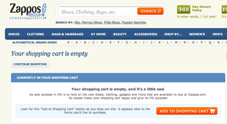
After removing the shoes from my shopping cart, I was surprised to find this:

Image

Your shopping cart is empty, and it’s a little sad. 

This was the point where I cringed a bit on the inside and realized that too much of a good thing (personification of shopping tools and actions) can be bad. Obviously, there isn’t a hard and fast rule to determine the right amount of personification, but I think what bothered me about this user experience is that I was being pushed toward making a certain choice by way of personification, and after I made the opposite choice, I was still pushed toward that same original choice by way of personification. The conclusion would be that such a tactic is better used in limited doses.

An Improvement to Amazon Checkout: Transparent Shipping Costs

One of the main reasons people use Amazon.com is because of low shipping costs. Many years ago (an eon in internet time), Amazon created the promotion of offering free shipping if the order size was at least $25. This was both a feature that was loved by customers and a feature that was business savvy (one side effect of such a feature is that it increases the average order size). More recently (several years ago), they created Amazon Prime which provides for free 2-day shipping (irrespective of your order total) if you have paid a yearly fee for the Prime service.

For items that are not sold directly by Amazon.com, the shipping options aren’t quite as awesome. In fact, many of these items do not have free shipping and offer standard rates depending on how soon you’d like the item. For these non-Amazon items, Amazon.com can improve the user experience when it comes to displaying shipping costs at the time of Checkout. Consider the following item:

Image

This experience is confusing for the user because it is not perfectly clear what the shipping costs are with each available shipping option. The user is required to manually select the radio button associated with a shipping option in order to view the corresponding shipping costs. For example, if the shipping option is changed to two-day shipping, the total is updated to reflect a cost of $20.45.

Image

The result of this lack of transparency between the various shipping options is going to lead to pogo-stick behavior by the user. The user will click on the different options they may have some interest in, only to bounce back to the original option if the shipping cost wasn’t what they deemed reasonable. Instead of encouraging this type of behavior (and wasting the user’s time and patience), the better experience would be to make the cost of each shipping option visible to the user from the get-go. Here is a sample mock-up of a better user experience:

Image

Activation of Amazon 1-Click Can Be Smoother

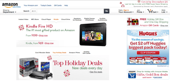
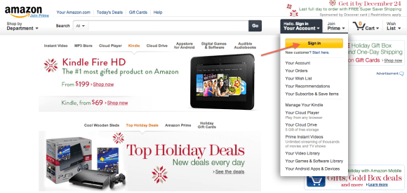
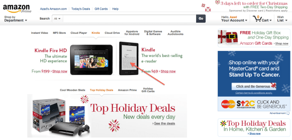
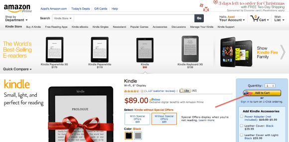
Amazon has a type of checkout, called 1-click, where you can complete the entire checkout process (specify the payment method, confirm the shipping address, select the delivery preference, etc…) just by clicking one button on the item page. By default, this setting is OFF. The flow they have to turn on this setting is a bit abrupt.

Image

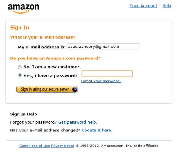
On the right hand side in the image above (highlights added by me), there is a secondary call to action underneath Add to Cart that states Sign in to turn on 1-Click ordering. Here’s what happens if you click on this link. First you see the sign-in page:

Image

No surprise here. After signing in, you see this:

Image

A confirmation page telling you that you have now signed up for 1-click. What happened?!? As a user, my expectation was to be taken to a settings page where I could check a checkbox, or toggle a radio button, or click a button to turn ON 1-click. As a general pattern, it is a bit odd for a user to see a confirmation page of any kind after signing into a site. Typically, you want to have the user sign-in, be verified, and then click on a final confirmation call to action to finish the flow. To have it occur immediately after the sign-in page was a bit abrupt.

For example, the user can be taken to a page that looks something like this where they could then confirm their decision.

Image

Amazon Student = Amazon Prime + Spam

One of Amazon.com’s greatest ideas has been the creation of Amazon Prime. One product that strengthens the Amazon Prime user base is Amazon Student. With Amazon Student, you get one free year of Amazon Prime when you provide your .edu email address. In addition, you get the subsequent year at a discounted rate as well. Great idea.

There is one down side. The catch is that you have to deal with marketing (spam) email from Amazon.com. For the most part, Amazon.com is very user friendly and I always see an opt-out or unsubscribe feature at the end of their emails to users. However, with Amazon Student, there is no opt-out or unsubscribe as can be seen in this email:

Image

It’s crystal clear:

If you would like to stop receiving e-mail offers from Amazon Student, you may cancel your Amazon Student membership here: …

In other words, the only way to stop receiving these marketing offers, is to cancel your Amazon Student membership. To give you an idea of how often this spam occurs, I’ve received 9 such emails since Jan. 1. So I’d say an average about two per month. Not too bad, but ideally, I shouldn’t have to setup a Gmail filter to stop getting such spam.

Encouraging Shopping Through Personification

I like this content from Amazon.com: 

Your Shopping Cart lives to serve. Give it purpose–fill it with books, CDs, DVDs, toys, electronics, and more.

While it’s a bit silly to think of the cart as “living to serve” as it’s obviously not a living entity, it’s a clever way to try to entice the user into adding items to their cart. 

Image

Amazon: Letter from the Top

I’ve seen both eBay and Amazon launch campaigns to their users that start off with a letter from the CEO on the home page. This is an interesting way to get your message across.

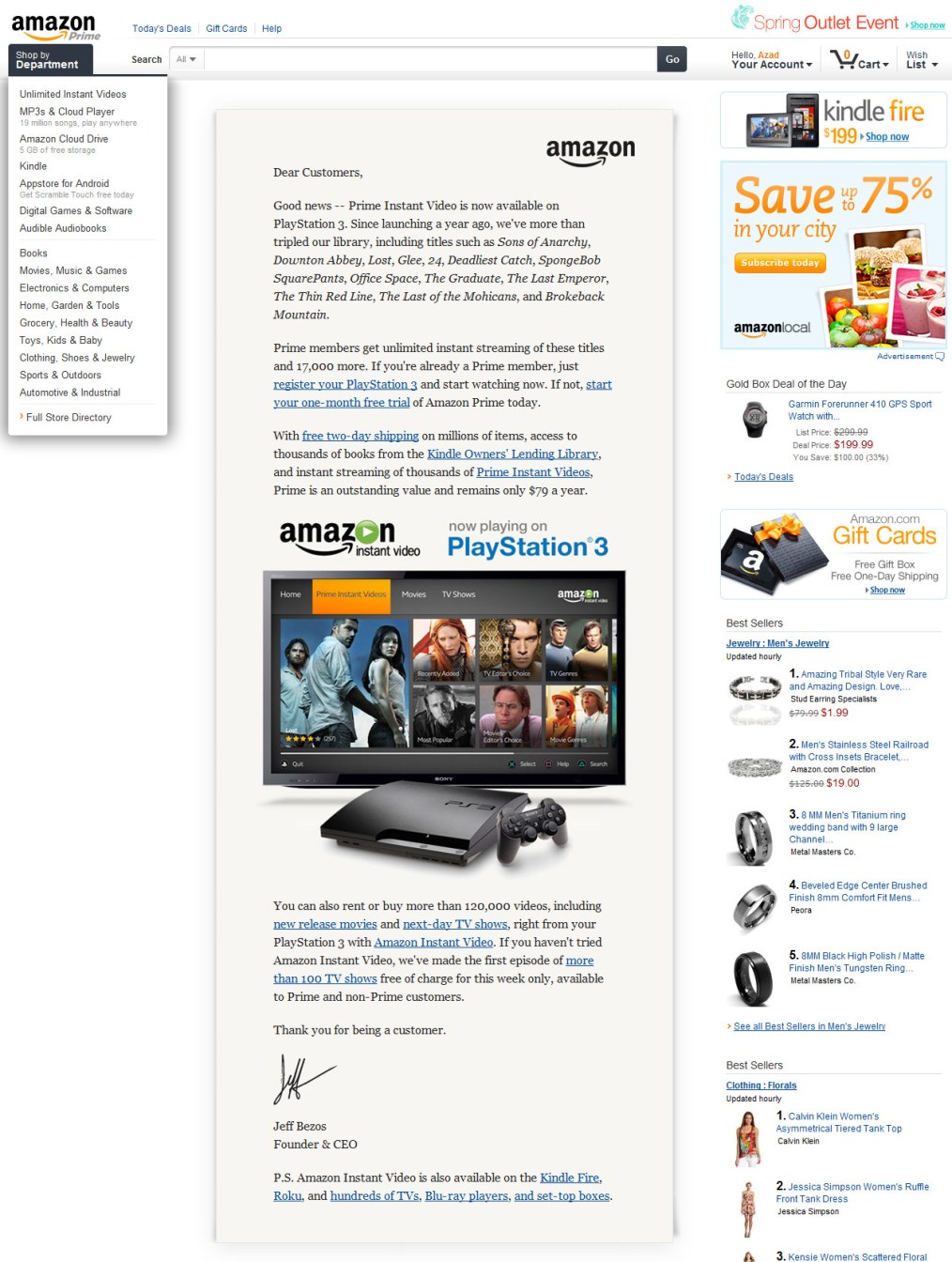
Typically, web sites would simply roll out a new feature and communicate the new feature with custom messaging. In the case of Amazon here, the user would come to the home landing page, and be shown a message regarding “instant video and PS3” and the user would probably ignore the message and move right along. Clearly, a letter from the CEO has the impact of making the message seem important as well as really capture the user’s attention. Obviously, this can’t be done with every feature – then it would become ineffective. So where to draw the line? Maybe just use this treatment once a quarter? Twice a year? Once a year? This is one of those features where the more you use it, the less effective it will become. 🙂

Image

Amazon Shopping Cart

An observation and an idea for the Amazon shopping cart. 

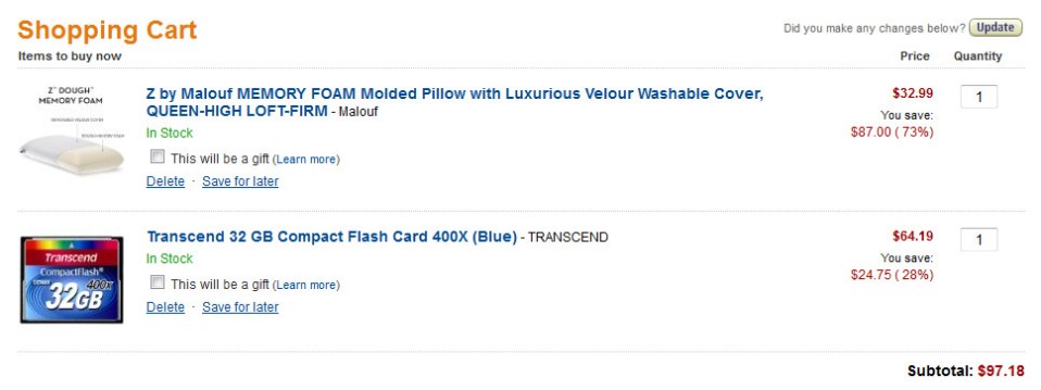
One thing I noticed about the Amazon shopping cart is that their call to action for a user to remove an item from their cart is a link with the text: “delete”. I was expecting to “remove” but was surprised to see “delete”. I think this subtle word difference is done on purpose in order to discourage users from clicking on that link. As a user, I place a very negative connotation on the word “delete”. It implies that by clicking on such a link, you will cause a permanent change. The word “remove” is much more innocent and temporary. It’s much easier to bring something back when it has been “removed” than when it has been “deleted”. 

Image

So what happens if I click on delete?

Image

Interestingly enough, the confirmation text says that the item was “removed”. =)

Now, on to an idea for how to improve on the delete/remove functionality. As a user, I may have removed the item by mistake and want to immediately bring it back – an undo function. I’m surprised Amazon doesn’t have this. 

Here’s a concept mock of how it could look. By clicking on the undo link, the item is immediately brought back into the cart. 

Image