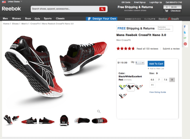
While trying to buy a pair of shoes from Reebok.com, I ran into a pretty clunky user experience for the mid-purchase suddenly out of stock use case. Here’s what happened: I added a pair of shoes to my cart and then was shown an error message.
Unfortunately for me, someone must have beat me to the last remaining pair of this specific type of shoe at this specific size. This is fine and boilerplate e-commerce. Happens all the time. But how would Reebok.com design the user experience for me?
A bit clunky I’d say. In the top of the page, I see an error message saying that one or more items … are no longer unavailable and that I should check my cart contents before continuing. This page isn’t too clear because according to the top of the page there’s a problem with an item in my cart and according to the bottom part of the page there are no products in my cart.
Sure, I understand that the reason why the item was taken out was because it became out of stock, but let’s see how this use case can be improved. For one, we can have the error message be more specific and tell me specifically which item became suddenly out of stock – as opposed to the more generic “one or more” catch-all. Second, it would be very beneficial for Reebok’s conversion if they pointed me to similar shoes to the one that suddenly became out of stock. From browsing their site, I know that they already have this feature built out — so they just need to invoke it here. If they can make those two changes, this clunky experience of losing out on a pair of shoes you really wanted can be improved and thus improve their end-to-end conversion.


