
Email marketing is a strong piece of the backbone of any consumer internet product. Recently, I went through the email unsubscribe flow of a couple of my favorite products: Sosh and Zipcar. While going through the respective flows, I noticed that one was a lot more user-friendly than the other. Let’s take a look.
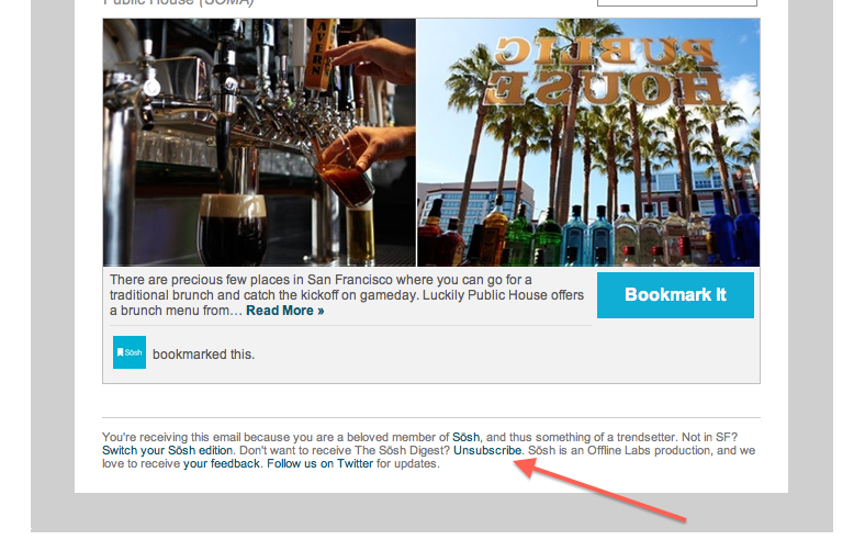
Here’s Sosh:
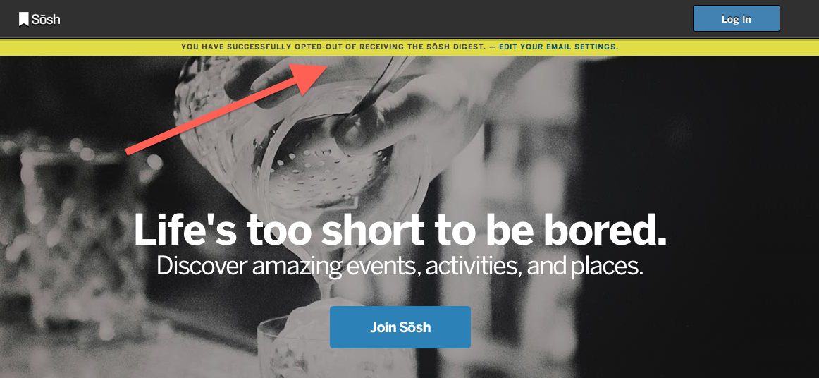
Here’s Zipcar:
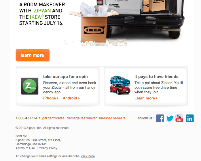
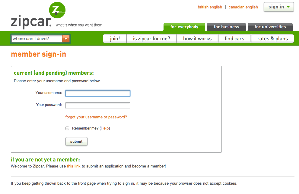

As shown above, the Sosh flow is a simple one step process with a CTA in the email followed up with a confirmation screen on the Sosh site. In contrast, Zipcar requires the user to first login before they are able to unsubscribe.
The Zipcar user experience is clearly less user friendly. But is this so bad? The advantage of the Zipcar approach is that they are creating more work for a user who wishes to unsubscribe and thus decreasing the amount of users who unsubscribe. However, this could be problematic. When a user goes to unsubscribe from a marketing email, they already have a semi-sour taste in their mouths about that product. When you create another (in their view) unnecessary hurdle in order to get them to perform this action, that semi-sour taste might turn into full blown disappointment and anger toward your product. Furthermore, the user can “punish” the company by going to their email client (i.e. Gmail) and marking the marketing email as spam. This may cause future marketing emails (even those sent to users who want to receive such emails) to be more likely to be marked as spam by the email client.
