Twitter Home Page Discourages Search

Twitter has cemented itself as the platform in which the greatest amount of publicly viewable micro-posts (or just posts in general) exist. One cool aspect of this seemingly infinite supply of real-time user content is the ability to search for real-time tweets reacting to a recent event. So while Google can serve as (or attempt to) the search engine for the entire Internet, Twitter can serve as the search engine of worldwide real-time reactions to a current event.

The interesting thing about this amazing functionality is that the use of this search feature is not supported from the home page: www.twitter.com. Here’s what the home page looks like as of today:

Image

Amazingly, there is no search bar at all in the page. Not in a prominent location in the center, nor is it on the header. The only reason one comes to know about the search bar in the first place is via it’s existence on a specific user’s profile page, such as:

Image

So why is Twitter doing this? Some possibilities:

1. Product miss. They don’t know that offering this functionality on their home page would lead to more user engagement and the opportunity to acquire non-users and convert them to new users.

2. They are doing this deliberately. The intention is to point existing users to signing into the home page, and for new users to sign up. These two user actions are critical and having a search bar (large or small) would lead to a distraction for an existing user or for a new user.

Advertisement

An Improvement to Amazon Checkout: Transparent Shipping Costs

One of the main reasons people use Amazon.com is because of low shipping costs. Many years ago (an eon in internet time), Amazon created the promotion of offering free shipping if the order size was at least $25. This was both a feature that was loved by customers and a feature that was business savvy (one side effect of such a feature is that it increases the average order size). More recently (several years ago), they created Amazon Prime which provides for free 2-day shipping (irrespective of your order total) if you have paid a yearly fee for the Prime service.

For items that are not sold directly by Amazon.com, the shipping options aren’t quite as awesome. In fact, many of these items do not have free shipping and offer standard rates depending on how soon you’d like the item. For these non-Amazon items, Amazon.com can improve the user experience when it comes to displaying shipping costs at the time of Checkout. Consider the following item:

Image

This experience is confusing for the user because it is not perfectly clear what the shipping costs are with each available shipping option. The user is required to manually select the radio button associated with a shipping option in order to view the corresponding shipping costs. For example, if the shipping option is changed to two-day shipping, the total is updated to reflect a cost of $20.45.

Image

The result of this lack of transparency between the various shipping options is going to lead to pogo-stick behavior by the user. The user will click on the different options they may have some interest in, only to bounce back to the original option if the shipping cost wasn’t what they deemed reasonable. Instead of encouraging this type of behavior (and wasting the user’s time and patience), the better experience would be to make the cost of each shipping option visible to the user from the get-go. Here is a sample mock-up of a better user experience:

Image

StarOne Home Page and the Unnecessary Timeout

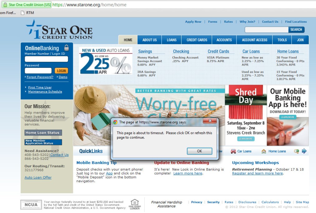
For banking sites, and other sites with secure transaction flows, it is standard practice to have the user’s web session timeout if they have been idle for some time. What is not standard is to apply this same type of logic to a user who has not even signed into the site.

After going to StarOne.org, and navigating away from the browser, I returned in about an hour. What I saw was surprising – the site had timed out even though I had never signed in. This is annoying and unnecessary. 

Image

Turning up the Volume on Investment Metrics

Two metrics that are tracked by stock investors and in particular day-traders is a stock’s volume and average volume. Volume is defined as the number of shares that have been traded in the most recent trading day. Average volume is the average number of shares that have traded per day a given amount of time i.e. a week, a month, or even longer. 

These two metrics are included on sites that provide stock quotes. Three examples are shown below. (Note that the average volume for Apple varies across the three sites as they are using different time periods to calculate the average.) 

ImageImageImage

So why do investors care about these two metrics, and could there possibly be a better way of interpreting this data to achieve more insight? 

To answer the first question, investors care about these metrics because volume and average volume give insight as to the daily sentiment of the stock and which way it is trending. For example, if a stock is up 3% with a volume of 10 million and this stock typically has an average volume of 10 million, there is probably nothing going on that is unique to this company and the market is just having a good day. However, if the stock is up 3% with a volume of 20 million when it typically has an average volume of 10 million, the stock headed up on this day most likely due to news unique to the company. This is an over-simplification, but it gives you an idea. 

To anser the second question, there definitely could be better ways of using this same exact data to extract just a tad more insight into the stock. Consider the two following metrics instead:

1. Volume / Average Volume

For day traders, they may glance at volume and average volume and quickly see if the two are much different. But exactly how different are they? An easier way to interpret this same data is to have a metric that divides volume by average volume to yield the day’s current volume as a percentage of the typical volume. In the case of Apple above, suppose volume is 15M and average volume is 13M, then this metric would be 15/13*(100%) = ~115%. In other words, today’s volume is approximately 15% higher than normal. 

2. Volume as a % of shares outstanding vs. Average Volume as a % of shares outstanding

Another way of looking at these numbers is to ask what chunk of all of the shares outstanding changed hands today? In the case of Apple, there are approximately ~930M shares outstanding. Thus, the volume as a % of shares outstanding would be ~1.61% and the average volume as a % of shares outstanding would be ~1.40%. In addition to showing you the signal of whether or not today’s volume deviates greatly from the average volume, this new metric also shows you on average how large of a chunk of a company is trading hands. One could generalize and say that stocks with a smaller percentage of stocks trading hands are less volatile than those with a larger percentage. 

Yelp, QR Codes, and Verified Purchases

One of the most common complaints that local businesses have about Yelp is the existence of unfair, or even worse, completely false reviews. In the current Yelp ecosystem, any user can write a review for any local business at any time. Thus, it is possible for a user to review a business that they interacted with many years ago (what if their recollection of their experience isn’t entirely accurate at this point?) or to review a business they never even actually used (what if the user’s personal bias leads to them leaving a one star or five star review even though they were never even an actual customer?).

Yelp attempts to mitigate this issue by automatically filtering out reviews that don’t meet a certain standard. By its very nature, any filtering algorithm will yield false positives (reviews that are genuine but where mistakenly filtered out) and false negatives (fake reviews that were not filtered and left on the site). In order to improve such an algorithm, it is vital to constantly feed useful data to the underlying model. Useful data is data that is known to show a high correlation with bad reviews (so the algorithm is more likely to filter the review) or with good reviews (so the algorithm is more likely to not filter the review).

A new piece of useful data, and a new input for the filtering algorithm, can be the concept of verified purchases. If Yelp somehow knew that for a fact, on a given date X, the user made a purchase at the local business for the amount of Y dollars, this piece of information would be invaluable. One way of achieving this product functionality is to partner with local businesses in order to have them add QR codes to the receipts they give their customers. Upon scanning the QR code with a user’s Yelp app, the application will automatically have access to:

  • The business name
  • The date of the purchase
  • The total purchase amount

For example:

Image

In order to evaluate the usefulness of such a feature and to be able to estimate whether or not it will be adopted and eventually succeed, one needs to consider what value such a feature brings to the table for the key parties.

Why would users use this?

  • Access to more deals and access to better deals. Since the local business knows that you’ve already spent money with them (and exactly how much), they are more likely to give you deals to keep you as a customer. Loyalty counts. The Yelp platform will allow any local business to have a loyalty program that has the potential to be as game-changing as the Starbucks Gold Card.
  • Giving more weight to your reviews. As a user, it feels great to know that the site that tracks the reviews considers my review as an important one because they know it comes from a verified purchase.

Why would local businesses do this?

  • More customer engagement. As a business, you know a lot of your users love Yelp. If you can give your users a way to stay engaged with you as a business while channeling that love through Yelp, why not? From your end, you can use the Yelp platform to offer deals to customers who scan the QR codes and check-in or write reviews and tips on Yelp.
  • More data for local businesses. Many small businesses know they are sitting on heaps of data pertaining to the habits of their customers, but they really haven’t done anything smart with the data. Yelp can serve as the platform that leverages this data and makes smart recommendations to the local business as to how best to keep their existing customers engaged and loyal.

Why would Yelp do this?

  • More Yelp engagement. This gives users another reason to use the Yelp product. This aspect is especially vital in new cities where Yelp is building a treasure trove of new user content from the ground up.
  • More data for Yelp. This gives an opportunity for Yelp to build out features (some free and some paid) for local businesses using the purchase data to see how customers are reacting to the business’s promotions.
  • More accurate reviews and a better Best Match algorithm. When a user uses a QR code to draft a review, Yelp has two important pieces of data. First, they know that this user actually completed a transaction with this business – this is a verified transaction. Second, they know how much money the user spent for this transaction. This is important because Yelp can then tweak their review algorithms to give more weight to verified purchases as well as give even more weight to purchases of higher amounts.

Southwest iPhone App “Suggest” Functionality Trails Web App

As smart-phone adoption continues to explode, gaps between a web app and mobile app experience are going to become more noticeable. Today I was booking flights on Southwest and noticed a subtle, yet important, gap between their iPhone app functionality as compared to their web site.

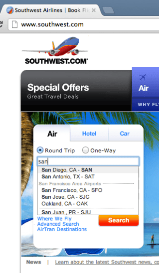
For a given flight, Southwest provides a nifty suggest functionality that gives you a list of possible airport names and their corresponding airport codes after you start typing in the city name. For example, here’s how it looks on the web site:

Image

Image

After entering “san”, the user is shown the different suggestions that would most likely match the city they are looking for. The other neat thing about this suggest feature is that it recognizes airport codes. So in addition to searching for San Francisco by entering “San …” you may also simply type in “SFO” like so:

Image

Well, it turns out that the suggest feature in their iPhone app is not as smart. It will recognize “San …” but it will not recognize airport codes.

Image

Image

Image

Ideally, there should not be a functionality gap here and the iPhone app should be able to find airports solely based on the airport code. From an engineering stand point, this is the whole point of creating an architecture that is built on top of services. If Southwest had a City Suggest Service internal API, both the web app and the mobile app could make use of it to provide identical functionality.

Gmail Lacks Undo for Deleted Messages

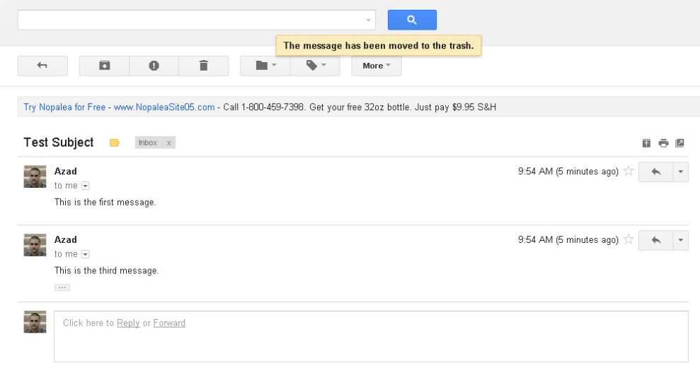
Gmail was one of the first (if not, the first) email applications to thread messages of the same subject into a single conversation. As I was playing around with this feature, I noticed a minor discrepancy between what happens when you delete a single message versus when you delete an entire conversation. It turns out that after deleting an entire conversation, Gmail gives you the ability to Undo (or undelete). However, the same is not true for deletion of individual messages. Let’s take a look. 

Image


Image


Image


Image


Image

Activation of Amazon 1-Click Can Be Smoother

Amazon has a type of checkout, called 1-click, where you can complete the entire checkout process (specify the payment method, confirm the shipping address, select the delivery preference, etc…) just by clicking one button on the item page. By default, this setting is OFF. The flow they have to turn on this setting is a bit abrupt.

Image

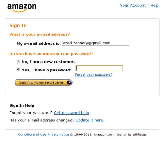
On the right hand side in the image above (highlights added by me), there is a secondary call to action underneath Add to Cart that states Sign in to turn on 1-Click ordering. Here’s what happens if you click on this link. First you see the sign-in page:

Image

No surprise here. After signing in, you see this:

Image

A confirmation page telling you that you have now signed up for 1-click. What happened?!? As a user, my expectation was to be taken to a settings page where I could check a checkbox, or toggle a radio button, or click a button to turn ON 1-click. As a general pattern, it is a bit odd for a user to see a confirmation page of any kind after signing into a site. Typically, you want to have the user sign-in, be verified, and then click on a final confirmation call to action to finish the flow. To have it occur immediately after the sign-in page was a bit abrupt.

For example, the user can be taken to a page that looks something like this where they could then confirm their decision.

Image