Twitter Doesn’t Work on Safari Mobile Web with Private Browsing Enabled

Safari on the iPhone offers users an option to enable private browsing. If you enable this setting, the browser will stop tracking your web history, your search history, as well as other user inputs such as usernames and passwords. Here’s how you enable the setting in iOS 6.0.1:

Image

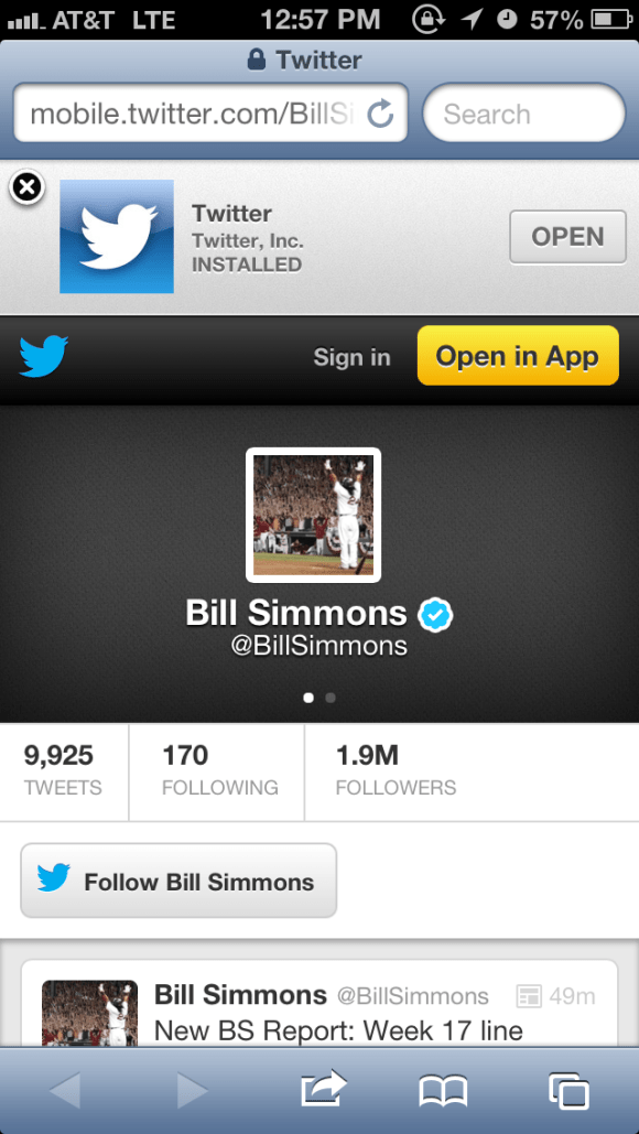
Today, I noticed that if I go to a user’s Twitter page while this setting is enabled for Safari mobile web, Twitter simply does not work. Here’s what the user sees in iOS Safari with private browsing enabled when the user goes to mobile.twitter.com/BillSimmons:

Image
Essentially, the user sees a blank page with nothing in it. The expected result can be observed when the private browsing setting is disabled:

Image

I really can’t think of a good reason for the Twitter mobile web experience to stop working correctly if the browser is in the private mode. Perhaps something having to do with cookies that Twitter is trying to manage on the user’s device and an error leading to nothing being shown. But either way, this is a predominantly read-only view and should be shown without issue to the user in either browser mode.

Advertisement

Adding Work to FB Timeline Missing Social CTAs in Mobile View

Something small, but grabbed my attention nevertheless. Recently, I consumed the same Facebook update across both my web news feed and my mobile news feed. In this update, one of my friends added a place of employment to his timeline. What was interesting is that in the web news story, I had the ability to like or comment on this story. However, in the mobile news feed, I did not have the ability to like or comment on it. Most likely, this was a miss when implementing the same feature for the iPhone app. 

Web news feed view. I have the ability to like or comment. 
Image


Mobile app news feed view. I do not have the ability to like or comment. 
Image

Southwest iPhone App “Suggest” Functionality Trails Web App

As smart-phone adoption continues to explode, gaps between a web app and mobile app experience are going to become more noticeable. Today I was booking flights on Southwest and noticed a subtle, yet important, gap between their iPhone app functionality as compared to their web site.

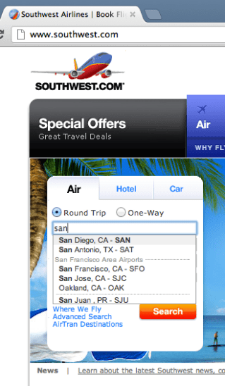
For a given flight, Southwest provides a nifty suggest functionality that gives you a list of possible airport names and their corresponding airport codes after you start typing in the city name. For example, here’s how it looks on the web site:

Image

Image

After entering “san”, the user is shown the different suggestions that would most likely match the city they are looking for. The other neat thing about this suggest feature is that it recognizes airport codes. So in addition to searching for San Francisco by entering “San …” you may also simply type in “SFO” like so:

Image

Well, it turns out that the suggest feature in their iPhone app is not as smart. It will recognize “San …” but it will not recognize airport codes.

Image

Image

Image

Ideally, there should not be a functionality gap here and the iPhone app should be able to find airports solely based on the airport code. From an engineering stand point, this is the whole point of creating an architecture that is built on top of services. If Southwest had a City Suggest Service internal API, both the web app and the mobile app could make use of it to provide identical functionality.

Changes to the Twitter Mobile Web Header

Recently, Twitter rolled out some subtle, but effective, changes to its mobile web header. Here is the previous version. The top left has a button that will take you to the Twitter mobile home page. This button consists of the previous bird logo (facing forward) and the Twitter name spelled out. “Sign in” and “Sign up” are the two buttons shown on the right. “Sign up” is the main call to action as highlighted by the yellow button background.

Image

Here is the new version. The home button in the top left has changed to the new logo (with the bird facing upward) and the Twitter name has been removed. The radical change to the right hand side is that the “Sign up” button has been removed and replaced with an “Open the app” button.

Image

I like these changes. First, changing the home button to take out the Twitter name makes the header cleaner. As mobile web real estate is limited, anything that can be done to make the look cleaner and less noisy for the user is a plus. The other side product of making the header cleaner is that users can focus on the two phrases on the header: “Sign in” and “Open the app” — instead of having a third phrase/word to read across the top.

The net result for the “Sign in” function did not change — as the treatment is identical in both versions. However, by replacing “Sign up” with “Open the app” Twitter may be sacrificing potential user registrations for a gain in iPhone App downloads and usage. This is hardly a trade-off as most iPhone users know that if they really wanted to sign-up, they could do so through many channels (i.e. going to twitter.com on their mobile device, clicking on the home button in the top left, or even through the app itself). Also, at this point, Twitter knows that since the adoption of its product is much further along than say a year ago, they can shift user behavior to different ways of using the product (i.e. mobile app over mobile web) as opposed to getting to use the product in the first place. With hundreds of millions (and counting) of registered users, they certainly don’t have to place an emphasis on user registration.

Yelp User Photos: Mobile vs. Web

As mobile/tablet user experiences become more widely used versus their (archeological) non-mobile/tablet web counterparts, there may be a divergence of functionality for the same feature on the same site for the different platforms.

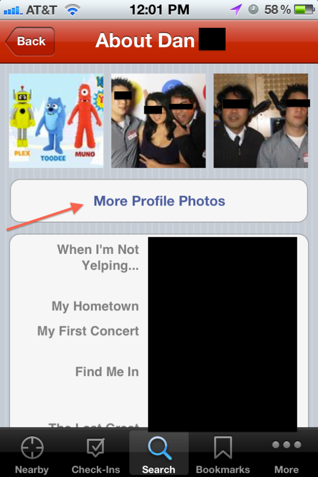
Consider Yelp user profiles and the corresponding user photos. In the iPhone Yelp App, I can browse to the user’s profile page and view all of their photos without being a Yelp member:

Image

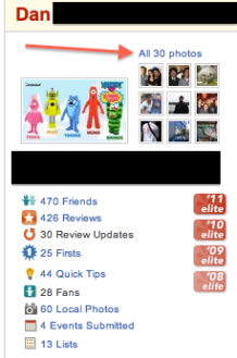
However, when I try to do the same on my laptop, I see the following:

Image

Image

Here, Yelp is asking me to log into my account, or register as a new user in order to view this user’s photos. Not sure if Yelp is making this distinction between iPhone and WebApp on purpose or if this is a bug, but let’s assume it’s on purpose. They may be making the bet that users are more willing to register and/or login in the non-mobile web flow as compared to the iPhone App flow. Why? Most likely, the user has a keyboard in front of them and can get to the next step more quickly than using their touchscreen device to login or worse, register for a new site. It’s an interesting strategy, but one that will may yield a drop-off in logins or registrations as users flock from their computers to smart phones and tablets.