Southwest.com View Travel Funds Enhancement

For frequent fliers, having the ability to change or cancel a reservation is very important. Southwest has a fairly friendly cancellation policy where at the very worst you will be able to hang on to credit for a purchased flight and reuse it on a future flight. There’s a section on their site where a user can check how much credit a specific confirmation number has.

This flow is not designed for the most seamless user experience and can definitely be improved. To begin, three pieces of information are required of the user:
1. Flier’s name
2. Flier’s previous flight confirmation number
3. Entry of a captcha code

When I tried to go through this flow, I could not get past step #3 no matter how many times I tried. In fact, from the message below, I’m not even 100% sure if this is the reason why I cannot proceed, but I’m 100% certain my name and confirmation number are correct.

Thinking more about the captcha code, I realized how unnecessary it can be. The purpose of requiring users to enter a code is to protect against fraudulent users who attempt to obtain airline credits by doing a brute force program to guess millions of confirmation numbers.

The enhancement I propose can easily guard against fraudsters while not ruining the user experience for the 99.9% rest of the users who are not fraudsters. Since Southwest.com has an account system where users can sign in, the site can relax the captcha restriction and require that the user enter a captcha code only after 5 failed attempts of their name/confirmation number pair. The idea is that since Southwest knows which user has logged in, they can do a rate-limiting solution instead of a one size fits all solution.

Good users wont be slowed down. Bad users will be stopped.

Image

Advertisement

Bank of America ATM Design Fail

Noticed something terribly wrong with the Bank of America ATM user experience for the deposit use case. There are two options for a deposit: (1) by check and (2) by cash. The problem with the design is that the buttons are placed on the page in the opposite pattern. In the touch UI, the cash option is on the left and the check option is on the right. In the physical insertion slots, it’s the opposite. The correct user experience would be for these two options to correctly match with their physical locations.

Image

Glitch in iPhone Date Module

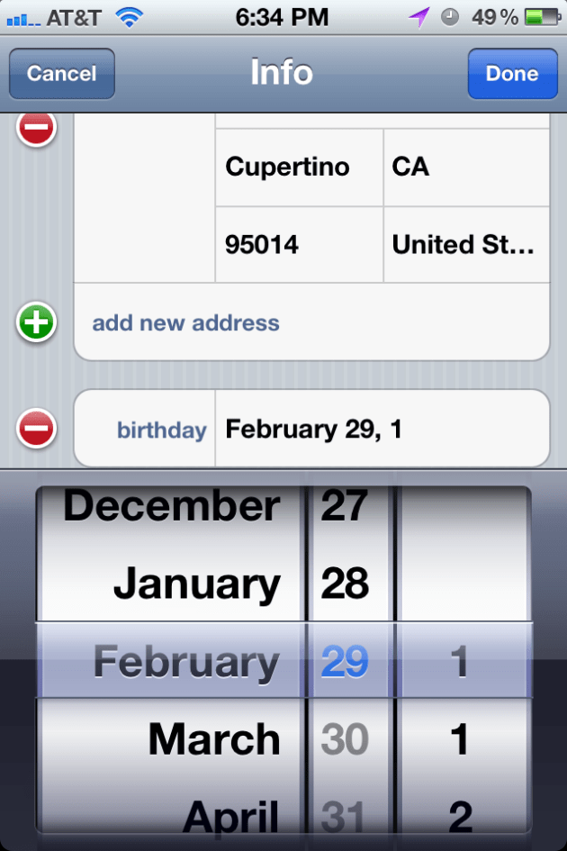
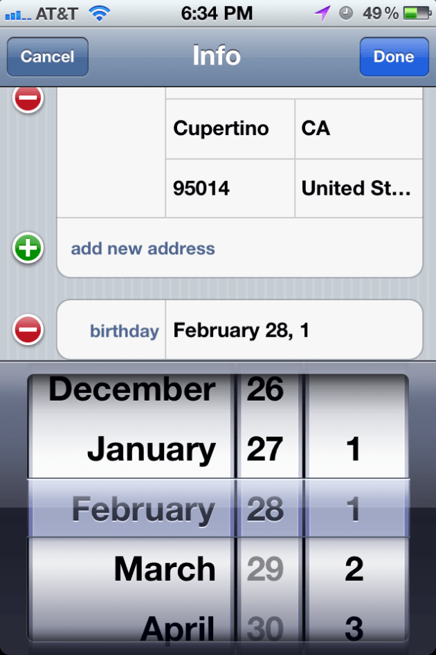
When you go to set a contact’s birthday in the iPhone date module, you will notice something strange if you go back in time quite a bit. By scrolling the year field as fast as you can, you can relatively easily reach the absolute end of time as it pertains to the iPhone date module. When you do this, you’ll notice something strange. The year “1” repeats twice at the beginning. Instead of the years going 0, 1, 2, 3, 4…, the years go 1, 1, 2, 3, 4…

Originally, I thought that maybe this was due to the module incorrectly repeating the year “1” twice. But this is not what is happening. It actually has the year “0” but it is listed as the year “1”. What do I mean by this? Technically, the year “0” was a leap year but the year “1” wasn’t. So if you go to the first “1” (which was supposed to be “0”), the date module will let you choose the month and day February 29. But if you try to do the same for the second “1”, the date module will not let you. 

Image

Image

Phantom Window Shown in Expose While Viewing PDFs

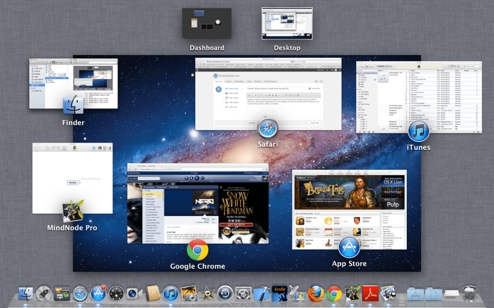
Expose is a feature in Apple OS X that allows you to see all of your open windows spread out nicely in front of you. They look as though they are on your desktop, and then you can click which window you want to take the focus back to. Here is an example: 

Image

While viewing a PDF document in Safari, I noticed an extra window in Expose that did not belong: 

Image

The title of the window is AdobePDFViewerNPAPI (Safari Internet plug-in). The correct user experience would be to not show this extra window when a user is viewing a PDF document in Safari.