Gmail Move to Inbox Glitch

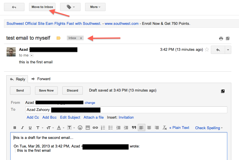
Found an tiny glitch in Gmail. When you access a draft reply of an email conversation already inside your inbox via the Drafts folder, Gmail incorrectly offers you the call to action to move the conversation to the inbox. Let’s take a look: 

1. Start with an email that is part of a Gmail thread that currently resides in your Inbox. As you can see, the top level CTAs offer you to archive the thread, mark it as spam, and send it to the trash, along with some other CTAs as well. 

Image

2. Click on Reply to start a reply thread. The top level CTAs remain the same. 

Image


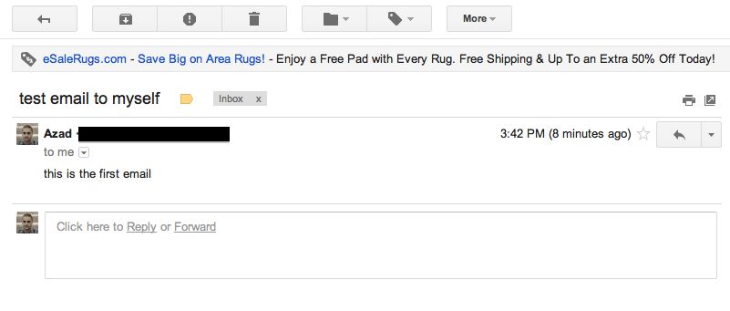
3. After the web app auto-saves your draft, wonder over to the left side-bar menu and click on the Drafts link. From here, find your draft reply and click and open the thread. 

Image


4. Here’s the interesting part. Instead of having the same top level CTAs as before (archive, spam, and trash), now the user is given the option to move the thread to the inbox. This is a bit strange as the thread is already in the Inbox. Ideally, Gmail should correctly differentiate between threads currently in and out of the Inbox and offer the correct top-level CTAs. 

Image


Advertisement

Improvements to the Etrade Unsubscribe Flow

I recently received a marketing email from Etrade and my first instinct was to unsubscribe from their marketing list. As I was going through their unsubscribe flow, I noticed something that simultaneously made me laugh out loud and angered me a bit. Let’s start with the email itself:

Image

Scrolling down to the bottom of the email, we see the all important and sought after unsubscribe section:

Image

Interestingly enough, they don’t use the word unsubscribe — perhaps because they know that people are trained to look for this word and perhaps they don’t want me to unsubscribe. 😉 On clicking through, here is the page that made me laugh:

Screen Shot 2013-03-12 at 4.55.03 PM

Here, the unsubscribe flow has selected the option to remain a subscriber by default! Now, this could be a case of the wrong radio button being selected due to a bug, but I’m inclined to believe that this is a product decision in order to reduce unsubscribes. While I understand the need to retain customers, this is a dishonest way to do so. The ideal experience would (1) have a clear “unsubscribe” link in the original email with the word “unsubscribe” and (2) make the default call to action on the landing page remain as unsubscribe while allowing the user an opportunity to opt out.

FB iPhone App Bug: Search Doesn’t Remember What You Like

Noticed a strange bug when searching for a business page on the Facebook iPhone App. Even thought I had previously liked the business, the search results still displayed a hollowed out thumbs-up icon that indicates I have not yet liked the business. Here’s how to reproduce the bug.

1. Start with a Facebook Page you’ve already visited and liked. Search for this Page in the iPhone app:

Image

2. Just in case you haven’t liked it yet, double check, and press down on the empty thumbs-up icon to like the page again:

Image

3. Visit the page and confirm that you have liked the page:

Image

4. Touch the top level menu to search again. Here you will see your previous search query correctly displayed in the liked state:

Image

5. Then, clear out the search box:

Image

6. Finally, search for the same page again. Now, you will see the page displayed again, but it is displayed incorrectly as if it is not in the liked state.

Image

FB in iOS: Making Sharing More Prominent

Noticed a recent change in the latest FB iPhone App which was presumably done for the purpose of increasing user engagement with stories in the news feed. Before the change, here is how a sample story would look like:

Image

As shown above, the Like, Comment, and Share calls to action are displayed as simple word links. In addition, the number of likes and comments for the story are shown in a similar treatment with the same amount of prominence and with the same color. 

With the most recent iOS FB app update, here is how this component looks like:

ImageSo what changed?

– The biggest change is the change of word links as the primary CTAs (call to action) to using buttons with icons as the primary CTAs. This is a very huge and radical change. One well-accepted best-practise of conversion for site/app flows is the usage of buttons instead of text links and another best-practise is the usage of icons instead of just words. Here, Facebook is adding two very important components: both the conversion of the word to a button, and the addition of the corresponding CTA icon.

– In terms of overall screen real estate, the primary CTAs are taking up more space. Also, the component that conveys the amount of likes and comments has increased in size. Instead of showing the amount of likes and comments next to their corresponding icons, they are now shown next to the words Likes and Comments.

Is this a good idea? Will this feature succeed?

On the surface level, this is certainly not one of those cases where one design is obviously better than the other. Rather, FB will just simply A/B test this feature and see which design yields a higher level of engagement. What’s interesting about this before and after is that the before had a more prominent display of how previous users had engaged with this story (i.e. the amount of likes and comments) and thus this would increase the probability of the current user wanting to get involved and like or comment. And in contrast, the new design is leaning more toward making the primary CTAs more prominent and more appealing-to-be-clicked instead of relying on the social pressure of the statistics of the story.