YouTube: Making Ads More Tolerable For Users

One way to monetize video content is to show an ad at the beginning of the video. When this was first done years ago on the internet, users would simply fast forward the video to skip over the ad and to wind up at the start of the content. Eventually videos were made in such a way where viewers could not skip over the ad and were required to watch the ad before the actual content could begin.

For many users, this became annoying. Users developed different ways to cope with these ads, i.e. sometimes the user would just close the ad and declare it wasn’t worth the price to pay to watch the video, or mute the volume and browse the internet on another page and come back when the ad is over (you had to have had good timing with this one or else the content may have started without you), or the user would just tough it out, get through the ad and then see the video.

No doubt the companies who placed these ads knew that they were annoying and not desired by many users. As a way to deal with this issue, YouTube has designed their ad interaction with some of their videos in a very clever way.

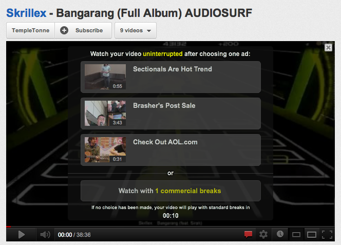
Here’s the beginning of a video on YouTube. At the outset, the user has an option to select one ad from three choices or watch the full video with one commercial break. This is amazing. Giving the user a real-time input into what ad they would have to watch in addition to getting to decide when to watch it makes the experience completely different.

Image

Here’s another approach. An ad starts of playing right away, and in the bottom right corner the user sees real-time messaging informing the user that they can skip the ad in a certain number of seconds. This is great for two reasons. One, it gives the user incentive to stick around knowing they don’t have to watch the full ad. Two, during the first five seconds, the ad may hook the user and the user may just stick around for the entire ad after all. In this case, YouTube can pick up extra revenue from the ad owner.

One final note: the video shows the amount of time left for the ad to conclude in the bottom left corner. This is another piece of information that is very useful to the user and sets expectations properly.

Image

Image

Advertisement

An Improvement to the 7×7 Mobile Footer

Here’s the 7×7 mobile site on the iPhone:

Image

When you scroll down to the bottom, you will see the footer:

Image

The various navigation options are:
EAT + DRINK
STYLE + DESIGN
ARTS + CULTURE
FITNESS + OUTDOORS
MUSIC + NIGHTLIFE
TECH + GADGETS
TRIPS AND TRAVEL

Notice that one of the options doesn’t belong with the others? Why does “TRIPS AND TRAVEL” have “AND” to separate the two related topics and all the other options have a “+”. In order to preserve consistency, the better title for this section would be: 

TRIPS + TRAVEL 

Pintrest – HUGE Amount of Likes & Repins: Accurate, Bug, or Deception?

I was browsing Pintrest this morning on my iPhone and noticed something strange. Most of the pictures that were being shared had a ridiculously large amount of “likes” and “repins”. Here are some examples:

Image

ImageImage

So to review, we have the following stats:

#1: Likes = 211,211 , Repins = 11,831,183
#2: Likes = 6,060 , Repins = 398,398
#3: Likes = 5,858 , Repins = 333,333

Wow! 11 million repins?!? Could this be real?? Then I looked at the numbers more closely. All of the numbers share one interesting characteristic, they are all a sequence of digits that is repeated TWICE. Take 211,211 – this is simply 211 repeated twice. Same with 11,831,183 and 1183. You get the picture.

So what’s going on here? There are 3 possibilities:
1. These numbers are accurate – very unlikely!
2. These numbers are due to a deliberate deception by Pintrest to make their site look more popular that it actually is – unlikely…
3. These numbers are due to a bug – most likely!

WordPress “New Post” Confirmation Page Can Be Improved

Noticed something strange after wrapping up a post on this blog the other day. After clicking on the “Publish Post” button on the “New Post==>Write a Post” page the page displayed a confirmation message as well as a link to view the new post. So far, this was expected. The weird thing I noticed was that, in addition to the in-page confirmation, the main call-to-action – the “Publish Post” button was still enabled on the page. So I asked myself the question, “what happens if I click on this button?”

Here’s what happens end-to-end:

1. Here is a sample test post I typed up to capture this experience. Step 1 is clicking on the “Publish Post” call to action.  

Image

2. The confirmation is this page. As can be seen, the “Publish Post” button in the bottom right corner is still visible and enabled. 

Image

3. I opened up a new browser tab and visited the main blog page: http://azadzahoory.com. As can be seen below, the recently completed post is shown at the top. 

Image

4. Going back to the new post confirmation page, I’m tempted to click on the “Publish Post” button one more time to see what would happen. Well, wouldn’t you know it, it publishes the post again!

Image

5. Back to http://azadzahoory.com we go, and we see this ridiculousness:

Image

What should WordPress.com do on this confirmation page? Simply put, the “Publish Post” button needs to be removed (along with the “tags” field in the bottom left) after a post has been published. 

And now, I will click on “Publish Post”. <click>

Funny Fatal Error Page From Hotels.com

Equating a fatal error with a “bump in the road” and showing a picture of a bicycle with a flat tire is pretty hilarious. 

I also like the “The good news is you haven’t broken the internet!” and “We’re working like maniacs…” content. Way to keep it humorous and low key. 

A bit questionable is the “Please tell us in your own words…” content. What, am I back in school, and I can’t plagiarize off of someone else and I have to describe it “in my own words”?

Image

What Happens When a Facebook Friend’s Account Is Deactivated?

Originally, I had thought that when you deactivate your account on Facebook, all traces of your account vanish and do not appear until you reactivate your account. 

But today, I was surprised to see that this is not the case. In fact, Facebook explicitly tells you that your friend has deactivated his/her account:

Image

I’m wondering why Facebook made this product choice…

Is it to prove to you that your friend didn’t de-friend you, and that they simply are taking a leave of absence?

Is it because they want you to reach out to your friend off of Facebook and ask them to come back to the ubiquitous social network? In a way, such messaging may be seen as a watered down scarlet letter on your friend. 

Honestly, I’m not sure I understand why this functionality is designed this way. To me, the more intuitive design would be to not include this friend in your friend list if they have deactivated their account.  

Amazon Student = Amazon Prime + Spam

One of Amazon.com’s greatest ideas has been the creation of Amazon Prime. One product that strengthens the Amazon Prime user base is Amazon Student. With Amazon Student, you get one free year of Amazon Prime when you provide your .edu email address. In addition, you get the subsequent year at a discounted rate as well. Great idea.

There is one down side. The catch is that you have to deal with marketing (spam) email from Amazon.com. For the most part, Amazon.com is very user friendly and I always see an opt-out or unsubscribe feature at the end of their emails to users. However, with Amazon Student, there is no opt-out or unsubscribe as can be seen in this email:

Image

It’s crystal clear:

If you would like to stop receiving e-mail offers from Amazon Student, you may cancel your Amazon Student membership here: …

In other words, the only way to stop receiving these marketing offers, is to cancel your Amazon Student membership. To give you an idea of how often this spam occurs, I’ve received 9 such emails since Jan. 1. So I’d say an average about two per month. Not too bad, but ideally, I shouldn’t have to setup a Gmail filter to stop getting such spam.

Great Customer Support Content From PeggyBank

PeggyBank is a service where you can mail in (old) physical media and they convert the media to digital format and conveniently place it in the cloud. Great product — I hope they succeed. 

Today, I was browsing their site and noticed some very effective content in the Contact Us page:

Just ask. We have a hard time saying no to you.

Image

I think this content can be very effective in attracting new customers. All too often, one would see something like “We guarantee your satisfaction!” or “We will do everything possible to make you happy!” but such sayings are so cliche and most people simply dismiss them as lacking actual power. But something like “Just ask. We have a hard time saying no to you.” is very open, inviting, friendly, and most of all plausible and does not seem like a gimmick. 

Facebook Map Submodule Broken in Timeline View

Noticed some weird and unexpected behavior when playing around with Facebook Places and Map view of all the places I’ve been to. Currently, on my timeline, I don’t see any Places-type posts. However, the map submodule on my timeline looks like this:

Image

Right off the bat, you can tell something is wrong for two reasons. 
1. If I had at least one place, it would be shown in the sub-module view, instead of the generic world map that is shown.
2. It incorrectly says that I have 13 places when I know I have a total of ZERO on my timeline.

So, when I click on the sub-module, I am taken to the Map view and I see this: 

Image

Now, this view is how I expect it to be. Zero places just like I thought. So why the discrepancy between the two views?

Let’s try an experiment. Why don’t I add a place I’ve been to?
Image

Now, the Places sub-module in the Timeline view looks like:
Image

So what happened was that the count of 13 was incremented to 14 because I added a place. OK, now what does the Map view look like?

Image

This is expected. Now, I’ve been to one place. So what would happen if I were to delete this place from my timeline?

Image

Here’s where we can see where the strangeness and the bug start to manifest. In the Map submodule on the Timeline page, I would expect the count to go back to 13 — as it was when we started this exercise, but NO! It is still at the new number of 14!!

Image

And when I go an check the Map view, the count is again zero. 

So to summarize, the main Map view works just fine, but the Map submodule in the Timeline view is broken because it does not decrement the counter after you have deleted a place from your timeline. 

iOS Update All Apps Bug (iOS Version 5.1)

Bug description: When going through the “Update All” flow in the iOS App Store, when the user hits the cancel key on the Apple ID login prompt, the user can no longer update their apps in flow. 

Steps to reproduce & actual results:

1. Go to the App Store when you have multiple Apps that need to be updated (note that this bug may also exist for the use case where only one app needs to be updated)
2. Click on the Update All button 

Image

3. On the Apple ID login screen, do not enter a password, and click cancel:

Image

4. You will be brought back to the previous page, BUT the Update All button has now been disabled. 

Image

Expected behavior: The Update All button should remain enabled.