Renny Gleeson: 404, the story of a page not found

A number of my previous posts have been about error handling and specifically about how some sites handle 404 errors. Some examples: here, here, and here.

Today, I saw a really cool TED talk on 404 errors. The speaker mentioned some things I’ve mentioned in my previous posts and in general, the talk was quite interesting.

Here is the YouTube link to the video.

In case the video gets taken down, the presenter was Renny Gleeson and the title of the talk was 404, the story of a page not found.

Advertisement

Google Finance Institutional Ownership Metric is Broken

Institutional ownership refers to the percentage of a company’s shares that is owned by large institutional investors such as mutual funds, hedge funds, pension funds, etc…

Most finance sites that provide stock quotes also track this metric. Based on what I can see, it looks like Google Finance may have a technical issue or two with the data they are showing for this metric.

I’ll provide two examples. The first is VeriFone. According to the Google Finance quote, this company has an institutional ownership of 103%. No need to double check with other finance sites. Already we can see that this is technically impossible (as the highest amount of ownership is by definition 100%).

Image

The second example is Google. According to the Google Finance quote, this company has an institutional ownership of 66%. Based on my limited knowledge of the stock market, this seemed way too low of a number. So after double-checking with a couple of other sites (Yahoo Finance & Etrade), I’m assured to know this number is actually closer to 83%.

Image

Most likely the Google Finance Institutionally Owned metric is simply outputting a number it gets from a stock service data feed. It could very well be the case that this feed is what is feeding the site the corrupted information. But either way, this is something that should be fixed.

Unnecessary Error Message in LinkedIn Twitter Flow

After signing into LinkedIn, you are taken to a personalized Home page. At the top, similar to Facebook, you will see a status update share module. In the bottom right hand corner of the module, near the Share call to action, you will see a checkbox to share the same status on Twitter. 

Image

If you are using this feature for the first time, you will be taken to a page hosted by Twitter that asks for your Twitter credentials and permission to have the LinkedIn web app post to your Twitter account:

Image

By clicking on the Cancel, and return to app link, you are taken back to LinkedIn, but you are shown the following unnecessary error message: 

Image

The correct user experience would be to either show one of the following: 
1. An informational message upon returning to LinkedIn
2. Not showing any informational or error message upon returning to LinkedIn 


Addressing a Privacy Issue in the BOFA iPhone App

Similar to its web counterpart, the Bank of America iPhone App has a mechanism that kicks in when the user’s session has expired. The user is shown an alert, but the last screen they viewed in the app is still visible:

Image

The problem with this treatment is that the alert does not protect the privacy of the user (and who knows perhaps there is a security hole as created by this alert but nothing I’ve picked up on yet). Whoever has picked up this phone and is now viewing the app can see the various account balances and the last four digits of the different accounts on this page.

A better treatment would be to mimic the standard practice for web flows and take the user to a specific logoff page or the home page and in both cases to not show any private account information. For example, the BOFA iPhone app can simply take the buyer back to the login page:

Image

An Enhancement to the iOS Low Battery Warning

As an iPhone user, one common user activity is to watch a video. While you’re watching a video, there are very few things that could occur that would justify the phone stopping the video and grabbing your attention. An example of something that would justify stopping the video would be an incoming phone call. 

I noticed an example where I did not appreciate the phone stopping the video. This occurs when the phone is running low on battery. If the phone reaches 20% or 10%, you will see a dialog alert like this and your video will stop mid-stream: 

Image

I do recognize that it is important for the OS to get the user’s attention for this use case, but I think there’s a better way of doing this. To explore a better way of doing this, we can look no further than the iOS update to how text messages are treated. Previously, text messages in iOS, would be shown as a dialog alert just like above: 

Image

As of iOS 4.0 (or was it 5.0?), text message alerts are not as intrusive and can float to the top of the page: 

Image

So the idea for this enhancement would be the same. If the user is watching a video, simply show them an alert but have it exist in the background with a dismiss button. This way, the user can continue to watch the video without being interrupted and know that their iPhone is about to run out of battery. 

Flipping Through iPhone Photos While Listening to Music

Yesterday, I noticed something unexpected when I combined the following two very common user actions on an iPhone:

1. Listening to music
2. Swiping through photos

Eventually, I landed on a video and to my surprise, the music stopped playing.
Image

At first, I was very confused. Had I played the last song in a playlist and had that song concluded? I navigated to the song and saw that was not the case. Then I came back to the video and thought some more and decided that this behavior is by design due to the OS preparing to play the video. And since it is preparing to show the video above, the music I’m listening to needs to be stopped.

But herein lies the problem. I hadn’t even clicked play yet. I may not even want to watch this video and may want to continue browsing through all of my photos and videos listening to my music uninterrupted.

The better user experience is to allow the music to continue playing until the user explicitly clicks on the Play command.

Twitter Mobile Registration Content Bug

Noticed an interesting error message when going through the Twitter registration flow on the Safari browser on the iPhone.

Let’s start with the main Twitter landing page shown when the user goes to http://www.twitter.com:

Image

When you click on Sign up, you will see the registration page:

Image

Here’s the interesting part. If you leave all of the fields empty and click on Sign up, you will see the error messages for each field that you did not properly fill out.

Image

All of the error messages make sense, except for the first one that is shown if the user does not enter their name. The text content is: translation missing: en, settings, name, hint

It’s pretty clear that instead of showing the correct error content, the app is showing some “code” content most likely from a configuration file. In this case, my guess would be that “en” refers to the English language, “name” refers to the text field for the error message, and “hint” refers to the name of the error content field that needs to be served to the user.

Gmail Compose Button: Compose vs. Reply

In an earlier post, I wrote about the Gmail Send button and its different color treatments for two use cases. In this post, I take a look at the Gmail Compose button for the two key use cases: (1) composing a new email and (2) replying to an existing thread. 

Here’s what the Compose button looks like in its default state – when the user signs into Gmail. It is a very bold red color and it clearly is the main call to action for the user. 

Image

Here’s what the Compose button looks like when you are sending a new message. The Compose button is no longer a bold red color — it simply has a plain very light gray background. The main call to action is the Send button. This makes sense. As a user, if you’ve entered the flow to create a new message, your next logical step is to send the message, not to compose a new message before sending the one you just worked on. 

Image

Here’s when things start to get a little strange. This is what the user experience looks like when you are replying to an active email thread. In other words, you are not creating a new email thread:

Image

In the image above, the Compose button is once again bold and red and the main call to action. The Send button has been relegated to back-up status and has the plain light gray background. I’m not sure it makes sense to not have the main call to action be for the user to send their reply. Why would you want the user to enter this flow and then take their attention away from completing the email and sending away? The better user experience would be to treat the Compose button the same for both new messages and replying to existing threads. Specifically, the Send button should be the main call to action and the Compose button should be the secondary call to action with a light gray background. 

Google and the Future of Maps on the iPhone

According to recent press reports, Apple may replace the Google Maps app on the iPhone with their own in-house Maps app. While this came as a surprise to me (Google Maps was one of the earliest apps on the iPhone and one of my most used apps), I’m eager to see how Apple can improve from the Google product. 

Recently, I noticed a use case for which I was annoyed with Google Maps, and this could be taken as an example of a room for improvement for any competing product. 

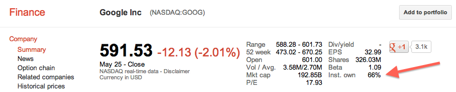
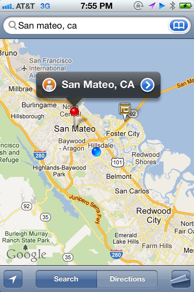
I was on the Caltrain going from Sunnyvale to San Mateo to meet a friend for dinner. Along the ride, I was curious to see how much distance (and time) remained ahead in my journey. So I pulled out my trusty iPhone, went to Google Maps, and searched for San Mateo, CA. What I wanted to do was to find the city and have the app calculate the distance (and time) remaining from my current location. My expectation was for the app to find the city and to serve up the city as a pin for me to touch and then go to the next level of calls to action. Google Maps found the city for me, but instead of serving up the city pin as the main call to action, I was shown the following: 

Image

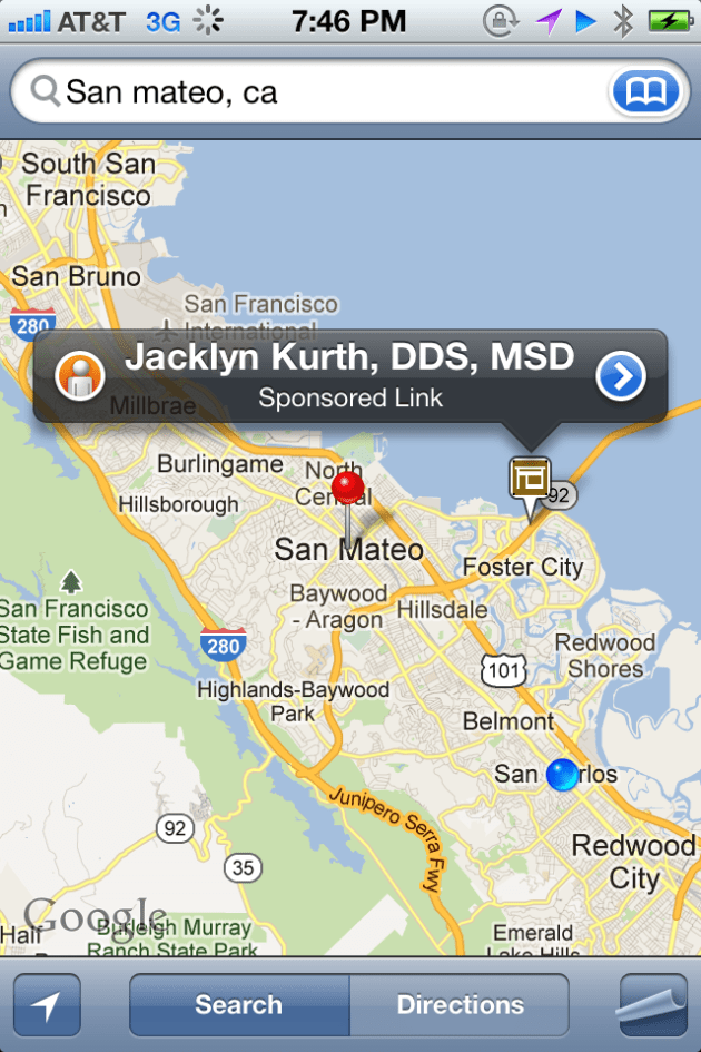
As can be seen in the image above, the primary pin shown to me was a sponsored result of a dentist near San Mateo. I had to manually touch the San Mateo city pin in order to toggle from the sponsored result to the desired result:  

Image

This example reminded me of Google’s famous motto, “Don’t Be Evil.” This motto means many different things to many different people. To me, it means that it is possible to make a business viable product while not drastically sacrificing the user experience for the purpose of generating revenue. Google Search (especially its earliest incarnations) was a great example of an extremely profitable product that kept a great balance with user experience. With the example above, I feel that for this product, Google crossed the line and sacrificed user experience a little too much in order to generate revenue. 

Google Finance and +1 vs. Yahoo Finance and Facebook Like: A Comparison

In an earlier post, I wrote about the +1 component of a stock in Google Finance. Recently, I noticed that stocks in Yahoo Finance had a similar social component: a module that captured the count of Facebook Likes. So I was curious as to how the counts of +1 in Google Finance compared against the counts of Facebook Likes in Yahoo Finance for a given stock.

In this post, I compare the number of +1s of a stock in Google Finance versus the number of Facebook Likes for a stock in Yahoo Finance for the top twenty US companies as ranked by market capitalization.

Here’s what the +1 module in Google Finance and the Facebook Like module in Yahoo Finance look for an example company, such as Apple (AAPL). (Note: red arrows added by me)

Image

Image

Here is the data for the top 20 companies:

Image

The first initial reaction is that, in general, the number of Facebook Likes is higher than the number of Google +1s. One big outlier is Google, and as explained in the earlier post, this is because users who use Google Finance are more likely to be employees of Google or even fans of Google products and thus in both cases more likely to be fans of the stock.

So what was the point of all this? I think that these numbers are a function of two parameters: (1) How effective the respective finance site is at drawing user traffic, and (2) How popular the Google +1 and Facebook Like features are for users who use such finance sites.