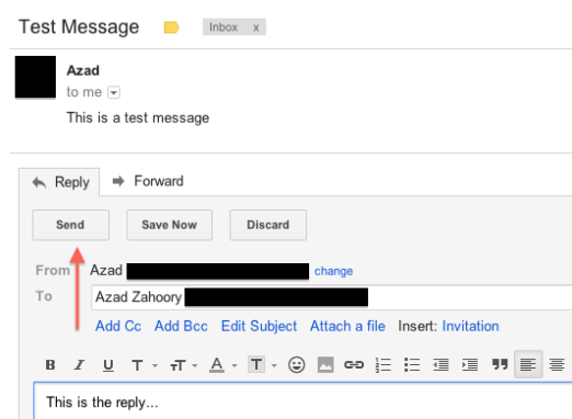
I don’t know if this is a bug or a feature, but the “Send” button in Gmail looks different for the following two use cases: (1) composing a new email thread and (2) replying to an existing email thread.
The key difference (which is obvious) is that the button is a solid red color. The other subtle difference is that the underlying text is all caps for the compose use case.
I’m fairly certain this is a feature (and not a bug) and the reasoning behind this would be to bring even more attention to the call to action in the compose use case as compared to the reply use case. At first I thought this may be due to Gmail wanting to prevent users from drafting messages and “losing” them due to not sending, but I realized Gmail already has a nifty auto-draft-save feature that will save your composed or replied draft automatically. Either way, you’re not likely to type something up, close your browser, and lose it forever. Perhaps, the difference they’re trying to call out is that an email user has more to lose by not sending out an original message (and being delayed on that front) than not replying to an existing thread (and being delayed on that front).
Compose:
Reply:


Pingback: Gmail Compose Button: Compose vs. Reply | Azad Zahoory