In an earlier post, I wrote about the Gmail Send button and its different color treatments for two use cases. In this post, I take a look at the Gmail Compose button for the two key use cases: (1) composing a new email and (2) replying to an existing thread.
Here’s what the Compose button looks like in its default state – when the user signs into Gmail. It is a very bold red color and it clearly is the main call to action for the user.
Here’s what the Compose button looks like when you are sending a new message. The Compose button is no longer a bold red color — it simply has a plain very light gray background. The main call to action is the Send button. This makes sense. As a user, if you’ve entered the flow to create a new message, your next logical step is to send the message, not to compose a new message before sending the one you just worked on.
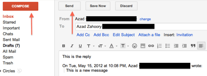
Here’s when things start to get a little strange. This is what the user experience looks like when you are replying to an active email thread. In other words, you are not creating a new email thread:
In the image above, the Compose button is once again bold and red and the main call to action. The Send button has been relegated to back-up status and has the plain light gray background. I’m not sure it makes sense to not have the main call to action be for the user to send their reply. Why would you want the user to enter this flow and then take their attention away from completing the email and sending away? The better user experience would be to treat the Compose button the same for both new messages and replying to existing threads. Specifically, the Send button should be the main call to action and the Compose button should be the secondary call to action with a light gray background.


