Adding Social Share CTAs to ESPN Mobile Videos

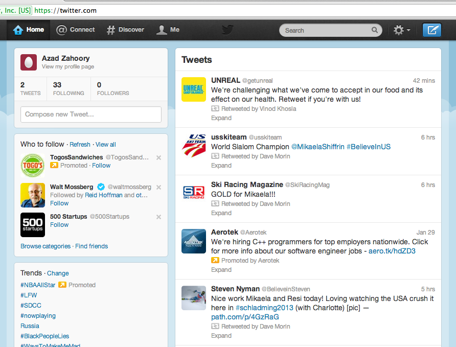
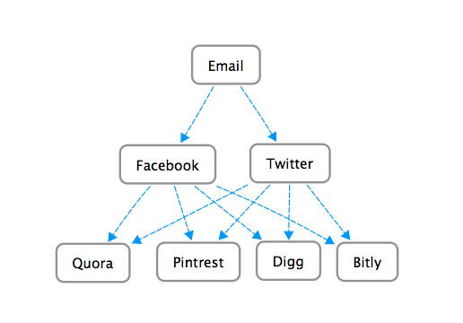
Seems like everywhere you look these days, users are given an opportunity to share something via Facebook, Twitter, Google+, LinkedIn, Digg, StumbleUpon, and the list goes on an on. While it may be a bit overboard to offer sharing via so many different channels, offering sharing across Facebook and Twitter can be quite beneficial to a product.

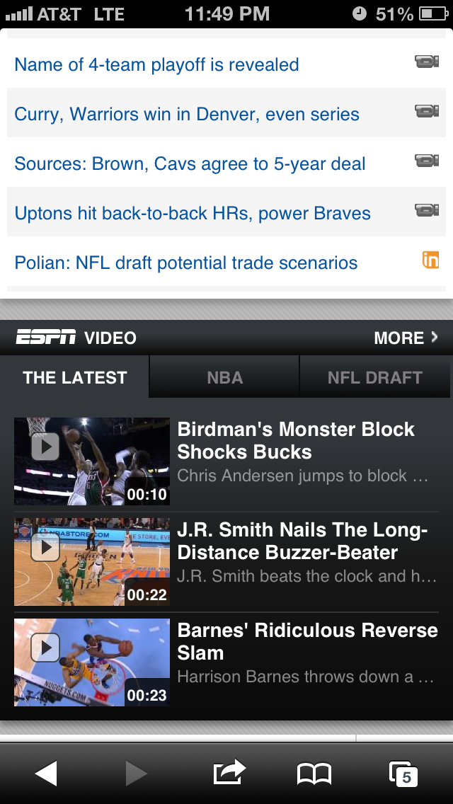
One area where sharing would be a logical fit would be across content sites such as espn.com. On their mobile site, they have a video module that typically had 3 videos that can be selected to be viewed.

Image


After clicking through, you are usually shown an ad and then the video.

Image


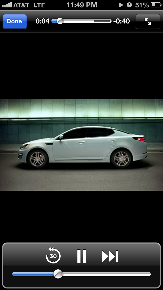
When the video concludes, you are taken to a video center page that shows you what video you just watched and asks you if you want to watch any more videos.

Image


At this point, this would be a GREAT opportunity for ESPN to offer the user the ability to share the video via Facebook or Twitter. This is no different than ESPN asking users to share articles via social channels. Except such a medium (video) may even have a more effective conversion rate of bringing new users back to the site.

Advertisement

Twitter Bug: Incorrect Redirect

Noticed a bug in the Twitter web flow when a non-signed-in user attempts to view another user’s Following list. For example, I was attempting to view the list of Twitter handles that Bill Simmons follows.  

Steps to reproduce: 

1. While you are not signed into your own Twitter account, go to a Twitter page and click on the Following module:

Image

2. At this point, you will be redirected to the sign-in flow. Presumably, this is because Twitter doesn’t want guest users (not signed in) to view this information: 

Image


3. After sign-in, you should be redirected to the user’s list of handles they are following. However, you are incorrectly redirected to your own Home feed:

Image


Twitter Doesn’t Work on Safari Mobile Web with Private Browsing Enabled

Safari on the iPhone offers users an option to enable private browsing. If you enable this setting, the browser will stop tracking your web history, your search history, as well as other user inputs such as usernames and passwords. Here’s how you enable the setting in iOS 6.0.1:

Image

Today, I noticed that if I go to a user’s Twitter page while this setting is enabled for Safari mobile web, Twitter simply does not work. Here’s what the user sees in iOS Safari with private browsing enabled when the user goes to mobile.twitter.com/BillSimmons:

Image
Essentially, the user sees a blank page with nothing in it. The expected result can be observed when the private browsing setting is disabled:

Image

I really can’t think of a good reason for the Twitter mobile web experience to stop working correctly if the browser is in the private mode. Perhaps something having to do with cookies that Twitter is trying to manage on the user’s device and an error leading to nothing being shown. But either way, this is a predominantly read-only view and should be shown without issue to the user in either browser mode.

Twitter Home Page Discourages Search

Twitter has cemented itself as the platform in which the greatest amount of publicly viewable micro-posts (or just posts in general) exist. One cool aspect of this seemingly infinite supply of real-time user content is the ability to search for real-time tweets reacting to a recent event. So while Google can serve as (or attempt to) the search engine for the entire Internet, Twitter can serve as the search engine of worldwide real-time reactions to a current event.

The interesting thing about this amazing functionality is that the use of this search feature is not supported from the home page: www.twitter.com. Here’s what the home page looks like as of today:

Image

Amazingly, there is no search bar at all in the page. Not in a prominent location in the center, nor is it on the header. The only reason one comes to know about the search bar in the first place is via it’s existence on a specific user’s profile page, such as:

Image

So why is Twitter doing this? Some possibilities:

1. Product miss. They don’t know that offering this functionality on their home page would lead to more user engagement and the opportunity to acquire non-users and convert them to new users.

2. They are doing this deliberately. The intention is to point existing users to signing into the home page, and for new users to sign up. These two user actions are critical and having a search bar (large or small) would lead to a distraction for an existing user or for a new user.

Changes to the Twitter Mobile Web Header

Recently, Twitter rolled out some subtle, but effective, changes to its mobile web header. Here is the previous version. The top left has a button that will take you to the Twitter mobile home page. This button consists of the previous bird logo (facing forward) and the Twitter name spelled out. “Sign in” and “Sign up” are the two buttons shown on the right. “Sign up” is the main call to action as highlighted by the yellow button background.

Image

Here is the new version. The home button in the top left has changed to the new logo (with the bird facing upward) and the Twitter name has been removed. The radical change to the right hand side is that the “Sign up” button has been removed and replaced with an “Open the app” button.

Image

I like these changes. First, changing the home button to take out the Twitter name makes the header cleaner. As mobile web real estate is limited, anything that can be done to make the look cleaner and less noisy for the user is a plus. The other side product of making the header cleaner is that users can focus on the two phrases on the header: “Sign in” and “Open the app” — instead of having a third phrase/word to read across the top.

The net result for the “Sign in” function did not change — as the treatment is identical in both versions. However, by replacing “Sign up” with “Open the app” Twitter may be sacrificing potential user registrations for a gain in iPhone App downloads and usage. This is hardly a trade-off as most iPhone users know that if they really wanted to sign-up, they could do so through many channels (i.e. going to twitter.com on their mobile device, clicking on the home button in the top left, or even through the app itself). Also, at this point, Twitter knows that since the adoption of its product is much further along than say a year ago, they can shift user behavior to different ways of using the product (i.e. mobile app over mobile web) as opposed to getting to use the product in the first place. With hundreds of millions (and counting) of registered users, they certainly don’t have to place an emphasis on user registration.

Unnecessary Error Message in LinkedIn Twitter Flow

After signing into LinkedIn, you are taken to a personalized Home page. At the top, similar to Facebook, you will see a status update share module. In the bottom right hand corner of the module, near the Share call to action, you will see a checkbox to share the same status on Twitter. 

Image

If you are using this feature for the first time, you will be taken to a page hosted by Twitter that asks for your Twitter credentials and permission to have the LinkedIn web app post to your Twitter account:

Image

By clicking on the Cancel, and return to app link, you are taken back to LinkedIn, but you are shown the following unnecessary error message: 

Image

The correct user experience would be to either show one of the following: 
1. An informational message upon returning to LinkedIn
2. Not showing any informational or error message upon returning to LinkedIn 


Twitter Mobile Registration Content Bug

Noticed an interesting error message when going through the Twitter registration flow on the Safari browser on the iPhone.

Let’s start with the main Twitter landing page shown when the user goes to http://www.twitter.com:

Image

When you click on Sign up, you will see the registration page:

Image

Here’s the interesting part. If you leave all of the fields empty and click on Sign up, you will see the error messages for each field that you did not properly fill out.

Image

All of the error messages make sense, except for the first one that is shown if the user does not enter their name. The text content is: translation missing: en, settings, name, hint

It’s pretty clear that instead of showing the correct error content, the app is showing some “code” content most likely from a configuration file. In this case, my guess would be that “en” refers to the English language, “name” refers to the text field for the error message, and “hint” refers to the name of the error content field that needs to be served to the user.

The Different Levels of Online Identity

Online Identity is an interesting topic. One way of looking at present day online identity is to think of it as being structured in a three level hierarchy. The most basic and top most level is email. It’s been around the longest and it’s the one constant required user input to register and use various web sites. With the advent of Web 2.0 and social networking, Facebook and Twitter became the two heavy-weights that comprise the second level of online identity. Many new web sites and mobile applications have moved to a model where the user may login or sign-up for the site or mobile application using their Level 2 (Facebook/Twitter) account. In other words, the user has the option of not even using an email address to login or sign-up. 

Let’s see how these different levels of online identity interact. First we’ll start with email and we’ll take a look at two popular email services: Gmail and Yahoo Mail. Here’s what the respective registration flows look like: 

Image

Image

Moving on to the Level 2 online identities, Facebook and Twitter, the registration process looks like:

Image

Image

As can be seen, a user is required to have an email account (a Level 1 identity) before they can register for Facebook and Twitter. 

Moving on to the Level 3 services/sites. Let’s consider the four following sites: Quora, Pintrest, Digg, Bitly.

Image

Image

Image

Image

So even though users can typically register for these Level 3 sites using an email address, they also have the option to login or sign-up using one of their Level 2 online identities. This is done for a couple of reasons. For one reason, the user acquisition flow is quicker. The user doesn’t have to fill out a form with their personal information in order to start using the site. They can start using the site right away. More importantly, having the user login or sign-up using a Level 2 identity gives the Level 3 site or mobile application a hook into the user’s Facebook or Twitter world. This is advantageous because it can make the overall user experience on the Level 3 site more pleasant for the end user. 

Finally, here’s a diagram I created that is a good way to visualize how these different levels interact: 

Image

Twitter Phantom Unfollow Bug

Noticed something strange when viewing a twitter page on the iPhone mobile view. There was a blue oval-looking button on the screen:

Image

When I clicked on it, I was shown a dialogue window asking me if I wanted to unfollow the account I was viewing. This was completely unexpected. As can be seen in the image above and the image below, I’m not signed into Twitter. So how can I unfollow someone, if I’m not even signed into an account?!?

Image

On click of Unfollow, the Sign in screen is presented to the user.

Image

The correct user behavior would be to not show a button to unfollow if the user is not signed in. If anything, the user should see a Follow button that should activate Sign in on click if the user is not signed in.