A Couple of Improvements to the Apple Online Store

I recently got a new iPhone 5. One of the things that’s important for me is to have a backup charger at my work in addition to the charger I keep at home. Naturally, I went to Apple.com to search for this item. Through this process, I noticed two specific spots for improvement. 

First thing I did was to click on the Store link in the header menu and to search for iphone charger. To my surprise, these were the search results:

Image

Only three items were returned, and none of them was the main charger that Apple sells for the iPhone 5. What gives? After further searching on the site, I realized that the reason why I couldn’t find the item I was looking for was because I was using the wrong search terms. According to Apple, the items I am looking for are referred to as:

– Apple 5W US Power Adapter (this is the plug portion of the charger)
– Lightning to 30-pin Adapter (this is the USB cable portion of the charger)

If Apple’s Store search was a bit smarter, it would be able to determine that a query for iphone charger should show the products called out above. 

The second improvement I’ll call out is something I noticed when I finally found the items I was looking for. They were located listed in the iphone accessories section on the site. Here’s what they look like: 

Image


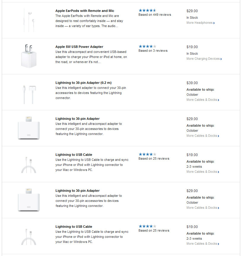
So the thing that is strange about how these items appear in the search results is just how challenging it is to discern what the photograph looks like. Why? Since many of these Apple products are white themselves in color, the contrast between the product’s color and the white background of the website is virtually nonexistent. Thus, as a user it is very hard to make out what these products look like. As an enhancement, Apple.com can consider changing the background color from something other than pure white. Perhaps off white or gray can work. 

Advertisement

A Clever Advertising Technique From Facebook

Saw something that grabbed my attention on my Facebook News Feed. What looked to be a typical like or comment by a friend of mine, actually happened to be an advertisement. Take a look at the following:

Image

On first glance, I thought that this was a post from Budweiser’s page that my friend had liked or commented on. However, upon further review and after looking more closely, I realized that my friend had no direct involvement with this specific post, but had rather only liked the Budweiser Facebook page.

What Facebook is doing, in effect, is making this advertisement seem contextually relevant in my News Feed — and less “Spam”y by tying my friend’s like with the ad. Do a thought experiment and ask yourself what your reaction would be if someone proposed dropping huge banner ads in the middle of a user’s News Feed. Completely preposterous and not feasible, right?!? Well, with this technique, maybe not as outrageous as one might think…

Invicta Watches and Perpetual Discounts as a Selling Technique

According to wikipedia, discounts have been used as a marketing technique since the late 1800’s. Traditionally, a buyer is given an incentive to make a purchase in the form of a temporary price reduction. The fact that the price reduction is temporary is exactly what gives the buyer the added motivation to make the purchase rather than wait to make the purchase later. But what if the discount is not a temporary price reduction, but rather a never-ending mark-down from the original price. Would consumers notice? Would they care? 

One product that seems to be using this new technique of offering a perpetual discount is Invicta Watches. A rudimentary search on Amazon shows that these watches are listed at various price points starting at $195 and ranging up to $695. However, the interesting thing is that these watches are always on sale at discounted rates ranging from $50 to $100. Here are the item listings on Amazon and one daily deal listing from eBay: 

ImageImage

So why are these watches always sold at a discount rate? Simply put, the purpose of such a marketing tactic is to create the appearance of perceived value. When a consumer is comparing two similar products to purchase, they will typically compare various attributes such as features included, quality, aesthetics, brand recognition, many others, and last but certainly not least price. If you’re looking at two watches, watch A and watch B which are very similar and watch A is $50 and watch B is $70, it’s a slam-dunk no brainer, you have to go with watch A. But, what if watch A has always been $50 and watch B has been marked down from $195. Then the consumer has to second guess their original conclusion and possibly give some weight to the fact that there may be some hidden value in the more expensive watch that they haven’t even realized yet!

The only down side of always selling at a discount is that your credibility as a product could take a hit if consumers notice that you are using this marketing ploy. But if you are a business where the majority of your customers are first time customers and are not likely to be repeat customers, then this doesn’t hurt you as much. 

[As a disclaimer, the reader may be wondering how the conclusion of a perpetual discount could be made simply with one day’s worth of data. The conclusions shared in this blog post are a result of noticing these pricing trends day-in and day-out over several years. If you’re still in doubt, do some Amazon, eBay, and Google searches for Invicta and you will be hard-pressed to find any site selling these watches at their full price.]


Facebook Album Photo Count Is Inconsistent

Noticed something strange in Facebook as it pertains to users who have pictures in albums that are not shared with me. For example, let’s take the profile of MG Siegler. If you navigate to his photo albums, you will see the following: 

Image


As can be seen above, the album dedicated to his profile pictures, which is always named Profile Pictures for all users, shows a question mark polaroid-like icon indicating none of the images are shared with me. What is interesting here is that while none of the photos are shared with me, I am told that there are 60 photos in this album. After clicking on this album, the user will see: 

Image


And here is the second strange part: the messaging on this page indicates that there are no photos in this album

A couple of thoughts:

1. It’s not a good user experience that on one page, the user is told that there are 60 photos, and on the next, the user is told that there are zero photos. A content edit may improve the second page by saying something like: This user has not shared this album with you. 

2. Is this a privacy glitch/bug on the first page? Perhaps MG Siegler wants the specific count of photos in this album to remain private. While it’s certainly not as bad as showing the photos to unauthorized viewers, is the public really authorized to know how many photos there are in the first place? 

Target.com Zoom Doesn’t Work For All Items

A standard part of shopping online is to pictures of items you are thinking about purchasing, and zooming in on those pictures for an up close view. For some items on Target.com, this functionality appears to be broken.

Consider the following item page for some t-shirts: http://www.target.com/p/hanes-men-s-5-2-bonus-pack-v-neck-tees-white/-/A-14140024

Image

On mouse-over on the main image on the page, you will see a control that allows you to zoom in on the image. On click, you will see the following:

Image

Ideally:

1. Target should have zoomed in photos for as many items as possible
2. If not, they should disable the zoom-in functionality on mouse-over

By not disabling the zoom-in control on mouse-over, the user is given the false expectation that they can see up close pictures of the item. Worse yet, after clicking on the zoom-in, they are taken out of the shopping experience entirely and to a dead-end page. This will no doubt lead to less purchases.

Zappos Shopping Cart Is Too Needy

In an earlier post, I wrote about how a site can sway the user into certain actions (such as making a purchase) through personification. Recently, I saw something that took this principle a little too far in my opinion.

After browsing for some shoes on Zappos, I had left an item in my shopping cart without paying for it. A day went by, and I subsequently received the following email:

Image

My first reaction was, “Awww, isn’t that cute?” my shopping cart wants me to complete the purchase. I smiled, decided I didn’t need the shoes, and went to the Zappos site to remove this item from my cart so I would no longer get this email notification.

After removing the shoes from my shopping cart, I was surprised to find this:

Image

Your shopping cart is empty, and it’s a little sad. 

This was the point where I cringed a bit on the inside and realized that too much of a good thing (personification of shopping tools and actions) can be bad. Obviously, there isn’t a hard and fast rule to determine the right amount of personification, but I think what bothered me about this user experience is that I was being pushed toward making a certain choice by way of personification, and after I made the opposite choice, I was still pushed toward that same original choice by way of personification. The conclusion would be that such a tactic is better used in limited doses.