In an earlier post, I wrote about how a site can sway the user into certain actions (such as making a purchase) through personification. Recently, I saw something that took this principle a little too far in my opinion.
After browsing for some shoes on Zappos, I had left an item in my shopping cart without paying for it. A day went by, and I subsequently received the following email:
My first reaction was, “Awww, isn’t that cute?” my shopping cart wants me to complete the purchase. I smiled, decided I didn’t need the shoes, and went to the Zappos site to remove this item from my cart so I would no longer get this email notification.
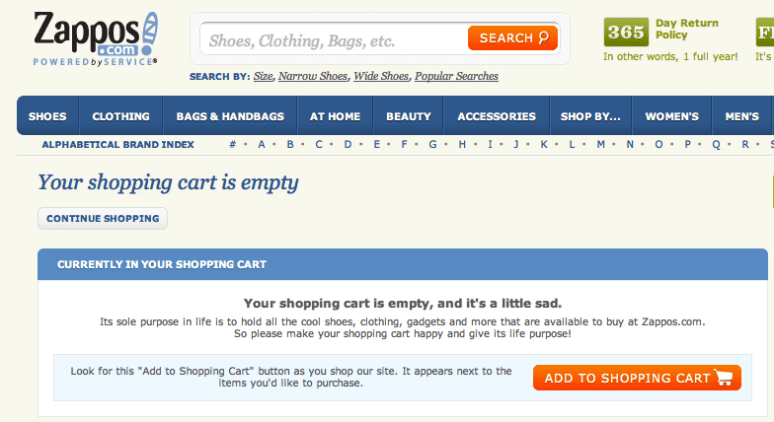
After removing the shoes from my shopping cart, I was surprised to find this:
Your shopping cart is empty, and it’s a little sad.
This was the point where I cringed a bit on the inside and realized that too much of a good thing (personification of shopping tools and actions) can be bad. Obviously, there isn’t a hard and fast rule to determine the right amount of personification, but I think what bothered me about this user experience is that I was being pushed toward making a certain choice by way of personification, and after I made the opposite choice, I was still pushed toward that same original choice by way of personification. The conclusion would be that such a tactic is better used in limited doses.


