
One of the main reasons people use Amazon.com is because of low shipping costs. Many years ago (an eon in internet time), Amazon created the promotion of offering free shipping if the order size was at least $25. This was both a feature that was loved by customers and a feature that was business savvy (one side effect of such a feature is that it increases the average order size). More recently (several years ago), they created Amazon Prime which provides for free 2-day shipping (irrespective of your order total) if you have paid a yearly fee for the Prime service.
For items that are not sold directly by Amazon.com, the shipping options aren’t quite as awesome. In fact, many of these items do not have free shipping and offer standard rates depending on how soon you’d like the item. For these non-Amazon items, Amazon.com can improve the user experience when it comes to displaying shipping costs at the time of Checkout. Consider the following item:
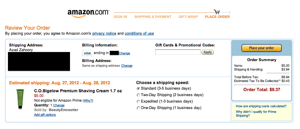
This experience is confusing for the user because it is not perfectly clear what the shipping costs are with each available shipping option. The user is required to manually select the radio button associated with a shipping option in order to view the corresponding shipping costs. For example, if the shipping option is changed to two-day shipping, the total is updated to reflect a cost of $20.45.

The result of this lack of transparency between the various shipping options is going to lead to pogo-stick behavior by the user. The user will click on the different options they may have some interest in, only to bounce back to the original option if the shipping cost wasn’t what they deemed reasonable. Instead of encouraging this type of behavior (and wasting the user’s time and patience), the better experience would be to make the cost of each shipping option visible to the user from the get-go. Here is a sample mock-up of a better user experience:

