
I was browsing through the connections of one of my own connections on LinkedIn. In other words, this is the equivalent of going through a friend’s list of friends on Facebook.
Here’s what I saw. I’ve blacked out the profiles that take up most of the screenshot, but the key part to observe is the numerical pagination at the bottom of the screen:
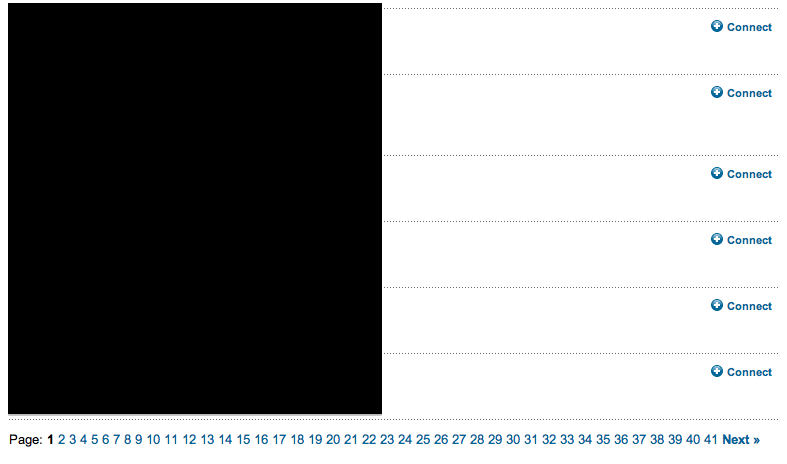
What struck me about this design is that the pagination is not very intuitive. How on earth do I know what page 4 has, and what page 34 has? The whole purpose of including these various options for the user is to make it easier for the user to find what they are looking for. In this case, I would be much better served if there were links to alphabetical letters representing the different last names of my colleague’s connections. That would be an entirely more intuitive approach.
Going back to the analogy of comparing this to Facebook friends of friends. That page is currently designed by using progressive loading of the page that eventually loads all of the friends of my friend. LinkedIn can use a similar approach (which they already do in their newer People You May Know page) or they can use alphabetical pagination for a more user friendly experience.
