How Shiseido Ruined a Mother’s Day Surprise

Recently I decided to get some skin care products for my mom for Mother’s Day. One of the best known brands out there is Shiseido. So I decided to go to their website, order a gift set, and have it sent to my mom for Mother’s Day. Through this process, I found their purchase experience lacking and was extremely disappointed in what happened during the post-purchase experience. 

As I was going through the purchase flow, two things captured my attention. The first was that Shiseido asks the user for an email address both during the shipping step and the billing step of the checkout flow. The standard checkout flow has a shipping section and a billing section, and the standard thing to do is to ask for the user’s email address during the billing section. The main use case where this matters is in the case of gifts. As the retailer, Shiseido should want to communicate with the purchaser of the items — not who the items are being sent to. 

Image

The second aspect of the purchase flow that captured my attention is what happens on completing the checkout flow. Or more precisely said, what surprised me was what didn’t happen. After completing the purchase, I was shown a standard checkout confirmation (aka “thank you”) page. 

Image

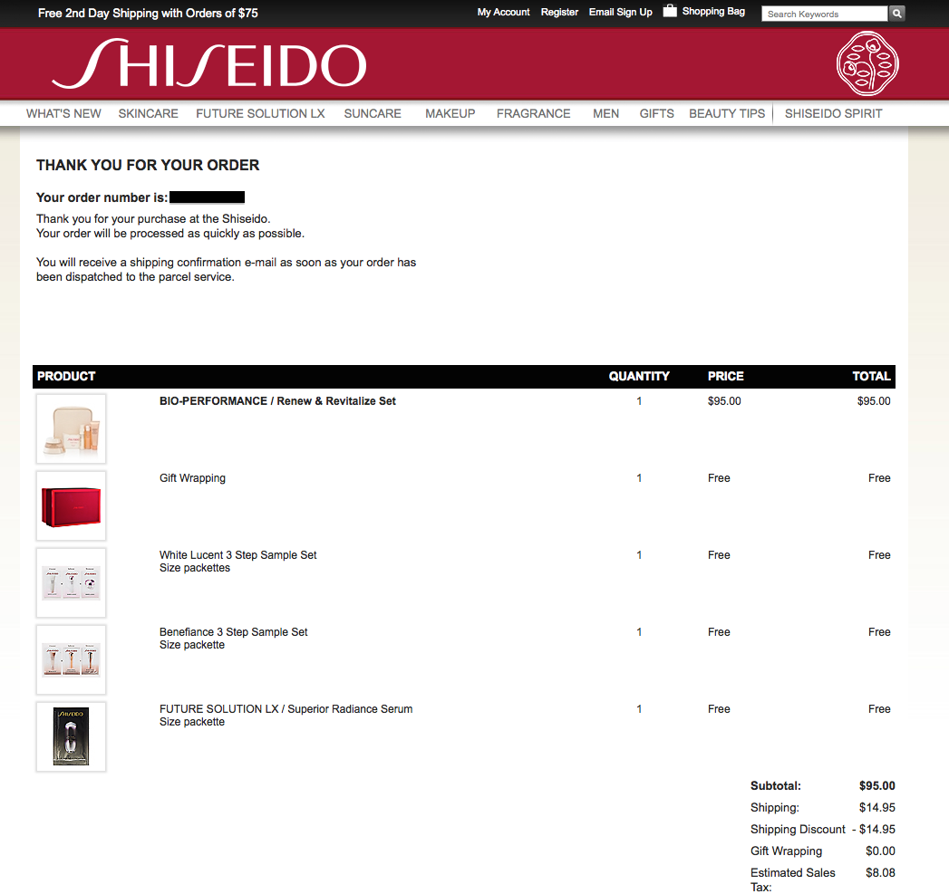
What I expected, in addition to seeing this page, was to receive an order confirmation email. Unfortunately, there was none. This is somewhat alluded to in the verbiage on the confirmation page “you will receive a shipping confirmation email…” which is somewhat reassuring. But the standard thing to do in this case is to send the user an order confirmation email to serve as a receipt for the purchase. If I close this page, and have a question about my order, what will I reference? 

The next part of this non-optimal experience with Shiseido.com occurred the day after I placed my order. I received an email from mom which was a forward of an email that Shiseido had sent her:

Image

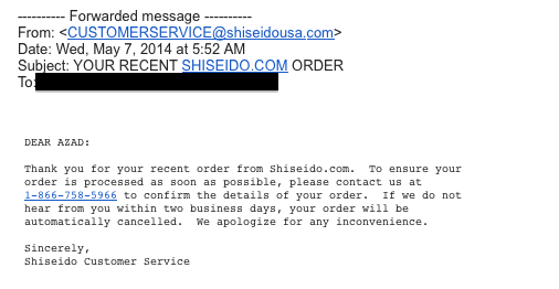
Essentially, there was something wrong with the order, and I needed to contact Shiseido to make it right. Upon calling their customer service number, I was asked to verify everything with the order: my billing address, the shipping address, and my credit card information (including expiration code, and CCV code). If not for the fact that it would be highly improbable for a fraudster to know that I had sent my mother a gift from Shiseido.com, the whole thing almost seemed like a phishing scam. I asked the customer service representative why I was being asked to verify everything all over again, and she said it’s because the shipping address and billing address did not match and that I had chosen the expedited shipping option. That being said, here’s what I think Shiseido did wrong, and should improve if they want to improve their business: 

1. It’s 2014, haven’t they heard of gifts? Of course the shipping address and billing address can differ. This is not a novel thing. In fact, in their purchase flow, I had the option to indicate that this was a gift.
2. As is the case with many gifts, many users will choose the expedited shipping option — again, this is not something new. 
3. Most importantly, if there is a problem with the billing information that needs to be reverified because a fraud alert has been triggered, the billing email address on file should be contacted — not the email address associated with the shipping address, as this inevitably will ruin many surprises. 

Advertisement

An Improvement to Kindle on iOS

Noticed something confusing as I was reading a book on my Kindle app on my iPhone. Even though I was on page 229 of 263, the bottom of the app said that I was only done with 64% of the book. I did the math and confirmed that, according to my page position, I was actually done with 87% of the book. 

Image

Was this a bug? Well, not so fast. The other data point being displayed is location. And according to that metric, I was at location 3946 of 6164, which turns out to be 64%. Based on what I can see, it looks like the key difference between page numbers and location is that page numbers start and stop based on the actual book content while location includes everything — even the table of contents as well as the acknowledgments and index at the end of the book. 

As a user, when I see the % complete statistic, what I really care about is how far I’ve come so far, and how much longer I need to go to finish the book. Thus, this metric should be based off of the page percentage and not the location percentage. 


Bug in Gmail Message Time?

Every so often I come across a user experience that is most likely a bug but could also possibly be by design. Here’s a good example. I often write myself emails through Gmail to serve as future reminders. Essentially overloading e-mail and leveraging it as a todo list. After sending myself an email from my laptop this evening, I noticed that Gmail told me that I sent the email 3 minutes ago – even though I had just sent the email. After some investigation, I saw that Gmail uses two different data sources to figure out when an email was written and how long ago it was written. Let’s take a look with a sample email: 

Image

Image

As can be seen in the second image above, 7:54 PM is based on the actual and correct time (according to Google’s servers) as to when the email was written. “3 minutes ago” turns out to be based on my computer’s internal clock. This can be easily reproduced by opening up the settings in OS X and changing the computer time to some time different than the correct time. 

Schwab Site Has Pre-historic Browser Requirements

When I went to the Charles Schwab site to view retirement plans, I saw something that made me laugh out loud. According to the splash page, their browser requirements are Netscape 4.06 (or higher) or Internet Explorer 4.01 (or higher). 

I don’t know which would be more shocking to me: 

  • If someone actually still uses one of these ancient browsers
  • If their current site is actually usable with one of these ancient browsers

Image

Improvement to FB Friend Confirmation Email

Noticed something strange when someone confirmed my Facebook friend request. In the email that Facebook sent notifying me of the friend confirmation, Facebook suggests some people who are connected to this new friend who I may also be friends with.

Image

This feature is useful and definitely makes sense given the context. However, when I click on the link of each user’s name, I am surprisingly not taken to that user’s profile page. However, I’m taken to a more generic page that has three modules: (1) open friend requests, (2) people I may know, and (3) a Search for Friends module.

Image

This is really strange and an unexpected user experience. Ideally, I’d be taken to the user’s profile which I clicked on — and there I can decide if I know that person and follow up with a friend request.

Bug in Yahoo iOS Stocks App

Noticed a bug in the Yahoo iOS Stocks App. When viewing the detailed metrics for individual stocks, the field for average volume is showing wildly incorrect values. Based on the examples included below, there doesn’t appear to be a pattern or obvious root cause to the problem (i.e. simply missing the M for million) as the numbers are all over the place. 

ImageImageImage

Google Maps and the BART Strike

One of my favorite features of Google Maps is routing using public transportation. This is extremely useful for anyone who doesn’t have a car. An interesting use case comes when a certain public transportation option is not available. Recently, BART, a highly utilized transportation system across the bay area shut down due to a strike by its union. So here’s what I saw when looking for directions into downtown SF:

Image

After clicking through the orange warning exclamation point icon, I saw:

bart2So here’s the interesting part. Based on the error messaging, the application should know (or should have a confident estimate) that this option is not viable for the user. Which is why the better user experience would be to include a different public transportation option in addition to, or instead of, all of the options that include a dependency on BART .

A Tactic to get Past the new Gmail Promotions Tab

Not too long ago, Gmail rolled out a new Inbox with customizable tabs which include notification emails from Social channels as well as a tab for Promotional emails. Some speculate that this new design may be a huge headache for marketers as it becomes even more challenging to get eyeballs on the emails that they send out.

I saw an interesting tactic to get past this challenge. In a fundraising email I received from JDRF, I was instructed to train Gmail to send emails from JDRF straight to the Primary tab instead of the Promotions tab.

Image

Image

By dragging the email from the Promotions tab to the Primary tab of my Inbox, I have the opportunity to create a rule to filter future messages from JDRF straight to the Primary tab of my inbox and thus increase the chances that I consume emails from JDRF.

One could argue that this tactic is simply a modern day parallel of the already existing “add our email to your contact list so that future emails are not marked as spam” email technique. It’ll be interesting to see if other products employ similar tactics to optimize their performance for Gmail users.

New Feature for LinkedIn: Refer a Connection

One of the most prominent use cases for LinkedIn is an email from a recruiter who is pursuing you as a potential candidate for a role they are sourcing. Here’s an example: 

Image

In the event you respond that you are not interested in the role, recruiters will often follow up and ask you if you know anyone in your network who would be a good fit for the role. Here’s an opportunity for LinkedIn to automate this functionality by having a separate CTA that lets you refer someone in your own network. Consider the following draft mock: 

Image


By clicking through, the user would have the ability to specify one or more connections in his/her own network to be referred to the recruiter. On the other end of the transaction, the recruiter will receive a LinkedIn message including the profiles of the referred candidates. A classic win-win-win situation. 


Zappos VIP Points Store leads to a Very Nice 404 Page

While I was browsing on Zappos, I noticed that they have a Points Store for their VIP users (which I happen to be): 

Image

After clicking through, I was served with an array of redemption options: 

Image

Here, the interesting thing is, any redemption option that I click on, leads to a 404 page: 

Image


While this is most likely a bug, and not the desirable user experience, the 404 page that I’ve been served is very creative and should be applauded. There are three options: Try A SearchGo Home, and Get Help. The most amazing thing about this graphic is that for each button that you hover your mouse over, you get a corresponding image that points you to where exactly that button takes you. Almost like a meta-site-awareness. Take a look below at the three screenshots for the three mouse hover states: 

Image


Image


Image