Gmail Compose Button: Compose vs. Reply

In an earlier post, I wrote about the Gmail Send button and its different color treatments for two use cases. In this post, I take a look at the Gmail Compose button for the two key use cases: (1) composing a new email and (2) replying to an existing thread. 

Here’s what the Compose button looks like in its default state – when the user signs into Gmail. It is a very bold red color and it clearly is the main call to action for the user. 

Image

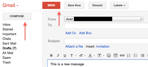
Here’s what the Compose button looks like when you are sending a new message. The Compose button is no longer a bold red color — it simply has a plain very light gray background. The main call to action is the Send button. This makes sense. As a user, if you’ve entered the flow to create a new message, your next logical step is to send the message, not to compose a new message before sending the one you just worked on. 

Image

Here’s when things start to get a little strange. This is what the user experience looks like when you are replying to an active email thread. In other words, you are not creating a new email thread:

Image

In the image above, the Compose button is once again bold and red and the main call to action. The Send button has been relegated to back-up status and has the plain light gray background. I’m not sure it makes sense to not have the main call to action be for the user to send their reply. Why would you want the user to enter this flow and then take their attention away from completing the email and sending away? The better user experience would be to treat the Compose button the same for both new messages and replying to existing threads. Specifically, the Send button should be the main call to action and the Compose button should be the secondary call to action with a light gray background. 

Google and the Future of Maps on the iPhone

According to recent press reports, Apple may replace the Google Maps app on the iPhone with their own in-house Maps app. While this came as a surprise to me (Google Maps was one of the earliest apps on the iPhone and one of my most used apps), I’m eager to see how Apple can improve from the Google product. 

Recently, I noticed a use case for which I was annoyed with Google Maps, and this could be taken as an example of a room for improvement for any competing product. 

I was on the Caltrain going from Sunnyvale to San Mateo to meet a friend for dinner. Along the ride, I was curious to see how much distance (and time) remained ahead in my journey. So I pulled out my trusty iPhone, went to Google Maps, and searched for San Mateo, CA. What I wanted to do was to find the city and have the app calculate the distance (and time) remaining from my current location. My expectation was for the app to find the city and to serve up the city as a pin for me to touch and then go to the next level of calls to action. Google Maps found the city for me, but instead of serving up the city pin as the main call to action, I was shown the following: 

Image

As can be seen in the image above, the primary pin shown to me was a sponsored result of a dentist near San Mateo. I had to manually touch the San Mateo city pin in order to toggle from the sponsored result to the desired result:  

Image

This example reminded me of Google’s famous motto, “Don’t Be Evil.” This motto means many different things to many different people. To me, it means that it is possible to make a business viable product while not drastically sacrificing the user experience for the purpose of generating revenue. Google Search (especially its earliest incarnations) was a great example of an extremely profitable product that kept a great balance with user experience. With the example above, I feel that for this product, Google crossed the line and sacrificed user experience a little too much in order to generate revenue. 

Google Finance and +1 vs. Yahoo Finance and Facebook Like: A Comparison

In an earlier post, I wrote about the +1 component of a stock in Google Finance. Recently, I noticed that stocks in Yahoo Finance had a similar social component: a module that captured the count of Facebook Likes. So I was curious as to how the counts of +1 in Google Finance compared against the counts of Facebook Likes in Yahoo Finance for a given stock.

In this post, I compare the number of +1s of a stock in Google Finance versus the number of Facebook Likes for a stock in Yahoo Finance for the top twenty US companies as ranked by market capitalization.

Here’s what the +1 module in Google Finance and the Facebook Like module in Yahoo Finance look for an example company, such as Apple (AAPL). (Note: red arrows added by me)

Image

Image

Here is the data for the top 20 companies:

Image

The first initial reaction is that, in general, the number of Facebook Likes is higher than the number of Google +1s. One big outlier is Google, and as explained in the earlier post, this is because users who use Google Finance are more likely to be employees of Google or even fans of Google products and thus in both cases more likely to be fans of the stock.

So what was the point of all this? I think that these numbers are a function of two parameters: (1) How effective the respective finance site is at drawing user traffic, and (2) How popular the Google +1 and Facebook Like features are for users who use such finance sites.

The Different Levels of Online Identity

Online Identity is an interesting topic. One way of looking at present day online identity is to think of it as being structured in a three level hierarchy. The most basic and top most level is email. It’s been around the longest and it’s the one constant required user input to register and use various web sites. With the advent of Web 2.0 and social networking, Facebook and Twitter became the two heavy-weights that comprise the second level of online identity. Many new web sites and mobile applications have moved to a model where the user may login or sign-up for the site or mobile application using their Level 2 (Facebook/Twitter) account. In other words, the user has the option of not even using an email address to login or sign-up. 

Let’s see how these different levels of online identity interact. First we’ll start with email and we’ll take a look at two popular email services: Gmail and Yahoo Mail. Here’s what the respective registration flows look like: 

Image

Image

Moving on to the Level 2 online identities, Facebook and Twitter, the registration process looks like:

Image

Image

As can be seen, a user is required to have an email account (a Level 1 identity) before they can register for Facebook and Twitter. 

Moving on to the Level 3 services/sites. Let’s consider the four following sites: Quora, Pintrest, Digg, Bitly.

Image

Image

Image

Image

So even though users can typically register for these Level 3 sites using an email address, they also have the option to login or sign-up using one of their Level 2 online identities. This is done for a couple of reasons. For one reason, the user acquisition flow is quicker. The user doesn’t have to fill out a form with their personal information in order to start using the site. They can start using the site right away. More importantly, having the user login or sign-up using a Level 2 identity gives the Level 3 site or mobile application a hook into the user’s Facebook or Twitter world. This is advantageous because it can make the overall user experience on the Level 3 site more pleasant for the end user. 

Finally, here’s a diagram I created that is a good way to visualize how these different levels interact: 

Image

Twitter Phantom Unfollow Bug

Noticed something strange when viewing a twitter page on the iPhone mobile view. There was a blue oval-looking button on the screen:

Image

When I clicked on it, I was shown a dialogue window asking me if I wanted to unfollow the account I was viewing. This was completely unexpected. As can be seen in the image above and the image below, I’m not signed into Twitter. So how can I unfollow someone, if I’m not even signed into an account?!?

Image

On click of Unfollow, the Sign in screen is presented to the user.

Image

The correct user behavior would be to not show a button to unfollow if the user is not signed in. If anything, the user should see a Follow button that should activate Sign in on click if the user is not signed in.

Google Maps Doesn’t Support Multi Destination Routes With Public Transportation

When looking for driving directions on Google Maps, it’s possible for the user to click on a link to Add Destination. By clicking on this link, the user can add another destination to their trip. For example, say you wanted to start in San Jose, travel to Mountain View, and then finally travel to San Francisco. This feature will let you obtain directions for all phases of the trip instead of having to go through this flow for each phase separately. A pretty nifty feature. 

Image

The interesting thing is that on Google Maps, it’s not possible to do this if you select public transportation as your method of travel: 

Image

Not sure why this is. From a functionality stand point it’s definitely possible for the service to be able to offer this type of user query. I checked the walking and cycling options — and they too offer the option of adding multiple destinations, so it’s a bit odd that you can not plan out a multi-destination trip using public transportation on Google Maps. 

iOS Bug: Cannot Delete Contact From “Text Message” View

In an earlier post, I wrote about how a user cannot delete a contact on their iPhone if they edit the contact details while entering from the Favorites view. Today, I discovered that the same bug (feature?) also exists if you attempt to edit the contact details while entering from the Text Message view. 

Suppose you are text messaging with a friend:

Image

And if for whatever reason (say your friend is no longer responsive [insert sad face]) you want to delete this friend from your contact list. The logical thing to do would be to click on the Contact button to view and edit contact details. On click, you will see: 

Image

By clicking Edit, you will see: 

Image

And if you scroll down all the way – similar to the behavior of entering via the Favorites view, you will not see a Delete Contact button:

Image

Chase.com Outage Treatment Can Be Improved

Wanted to access my credit card statement on Chase.com and encountered a couple of different error messages. It appears that Chase.com was having an outage. There are typically two flavors of outages: the planned outage (this is when the website or application needs to do some scheduled maintenance and the company has no choice but to completely stop a key site flow or the entire site) and the unplanned outage (this typically occurs when there is an unexpected software or hardware problem that brings down a key site flow or the entire site).

Here are some screenshots:

Image

First thing I noticed when I encountered the page above was the “We’re sorry this website is temporarily unavailable” page title. I think better content would be to refer to Chase.com or “we” i.e. “We’re sorry but we are currently undergoing maintenance.” or “We’re sorry but Chase.com is currently unavailable” — the reference to “this website” is a bit informal. I also noticed the “chase_outage.htm” in the URL. This made me wonder about whether or not this was planned or if this message is put up during an unplanned outage.

At various other points, I got the page below. It’s pretty clear that this page is not at all useful to the user.

Image

iOS Bug: Cannot Delete Contact From “Favorites” View

Noticed some interesting behavior related to iPhone contacts. While viewing a particular contact details as initiated from the “Favorites” section, it is not possible to delete the contact. However, while viewing the same contact from the main contact list, it is possible to delete the contact. 

Let’s start with the typical use case. Start with a contact who is on your list of Favorites. Click on the Contacts icon and search for this contact amongst all contacts. Click on the contact to view details. Note the highlighted “Contacts” icon toward the bottom center of the image below:

Image

Click on the edit button in the top right corner to see this: 

Image

If you scroll all the way down, you will see the big red rectangular button to delete the contact:

Image

Let’s now look at this contact’s details from the Favorites view:

Image

Click on the arrow to see details:

Image

Click on edit to see:

Image

Scroll all the way to the bottom and you will NOT see the big red rectangular delete button!!

Image


Update: 7×7 Home Page Uses “+” and Not “AND”

In an earlier post, I wrote about the 7×7 mobile footer. Specifically, how there is an inconsistency with the last menu option as compared with the others. To recap, “TRIPS AND TRAVEL” used the word “AND” to join the two topics instead of a “+”. 

Today, I discovered that this is definitely a mistake as their main web site uses a “+” to join the same two topics:
Image