Southwest iPhone App “Suggest” Functionality Trails Web App

As smart-phone adoption continues to explode, gaps between a web app and mobile app experience are going to become more noticeable. Today I was booking flights on Southwest and noticed a subtle, yet important, gap between their iPhone app functionality as compared to their web site.

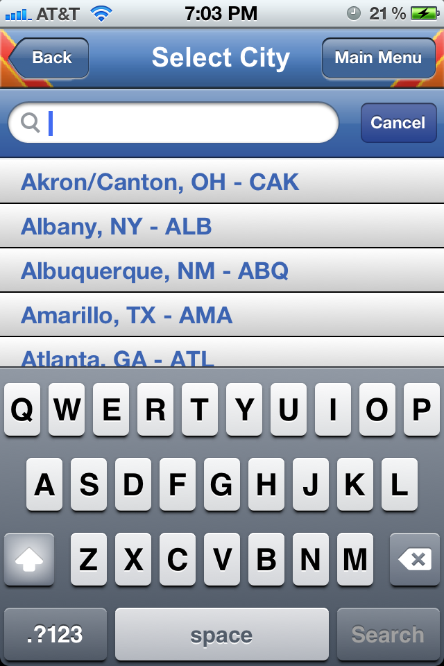
For a given flight, Southwest provides a nifty suggest functionality that gives you a list of possible airport names and their corresponding airport codes after you start typing in the city name. For example, here’s how it looks on the web site:

Image

Image

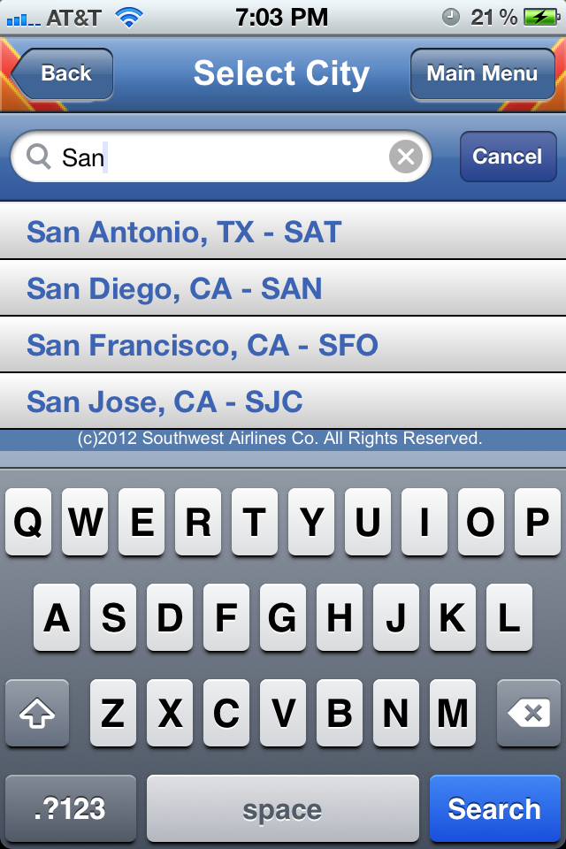
After entering “san”, the user is shown the different suggestions that would most likely match the city they are looking for. The other neat thing about this suggest feature is that it recognizes airport codes. So in addition to searching for San Francisco by entering “San …” you may also simply type in “SFO” like so:

Image

Well, it turns out that the suggest feature in their iPhone app is not as smart. It will recognize “San …” but it will not recognize airport codes.

Image

Image

Image

Ideally, there should not be a functionality gap here and the iPhone app should be able to find airports solely based on the airport code. From an engineering stand point, this is the whole point of creating an architecture that is built on top of services. If Southwest had a City Suggest Service internal API, both the web app and the mobile app could make use of it to provide identical functionality.

Gmail Lacks Undo for Deleted Messages

Gmail was one of the first (if not, the first) email applications to thread messages of the same subject into a single conversation. As I was playing around with this feature, I noticed a minor discrepancy between what happens when you delete a single message versus when you delete an entire conversation. It turns out that after deleting an entire conversation, Gmail gives you the ability to Undo (or undelete). However, the same is not true for deletion of individual messages. Let’s take a look. 

Image


Image


Image


Image


Image

Activation of Amazon 1-Click Can Be Smoother

Amazon has a type of checkout, called 1-click, where you can complete the entire checkout process (specify the payment method, confirm the shipping address, select the delivery preference, etc…) just by clicking one button on the item page. By default, this setting is OFF. The flow they have to turn on this setting is a bit abrupt.

Image

On the right hand side in the image above (highlights added by me), there is a secondary call to action underneath Add to Cart that states Sign in to turn on 1-Click ordering. Here’s what happens if you click on this link. First you see the sign-in page:

Image

No surprise here. After signing in, you see this:

Image

A confirmation page telling you that you have now signed up for 1-click. What happened?!? As a user, my expectation was to be taken to a settings page where I could check a checkbox, or toggle a radio button, or click a button to turn ON 1-click. As a general pattern, it is a bit odd for a user to see a confirmation page of any kind after signing into a site. Typically, you want to have the user sign-in, be verified, and then click on a final confirmation call to action to finish the flow. To have it occur immediately after the sign-in page was a bit abrupt.

For example, the user can be taken to a page that looks something like this where they could then confirm their decision.

Image

Restaurants Appear Deceptively Closer in Yelp

Like almost every other SF inhabitant, I have a passion for great food. A byproduct of this hobby is that I’m often on Yelp scoping out new places to try. Other than gauging the quality of the dining experiences by reading reviews, I’m also on the lookout to see how far a restaurant is from my current location.

Recently I noticed a discrepancy between the distance as called out by Yelp search results as compared to the driving directions I received when using Google Maps. Take the following example. While I was in Dillon Beach, CA, I found a restaurant in a nearby city called Barley and Hops Tavern. According to the Yelp search results, this dining establishment was located 10.3 miles away.

Image

However, when I queried Google Maps for directions between my current address and the restaurant’s address, I received a significantly different result in terms of distance:

Image

According to Yelp, the restaurant was 10.3 miles away, but according to Google Maps, it was at least 16.2 miles away. Who was right, and who was wrong? Could it be possible that one of these sites is using incorrect data to calculate the distance or has a bug in their distance algorithm.

The funny thing is – I think both sites are correct, but for different reasons. The reason why the distance on Yelp looks significantly shorter is that Yelp is computing the distance as the crow flies. In other words, while Google is computing the driving distance (which takes into consideration turns and zig zags in different directions), Yelp is considering the distance on the map if you were to physically draw a straight line between the two points.

In terms of what’s best for the user, the expectation is to see how far the two points are – not for geographical curiosity – but for the purposes of planning a trip from point A to point B. That being said, the Google way (not computing as the crow flies) of calculating the actual driving distance is ideal and the preferred way to go.

Changes to the Twitter Mobile Web Header

Recently, Twitter rolled out some subtle, but effective, changes to its mobile web header. Here is the previous version. The top left has a button that will take you to the Twitter mobile home page. This button consists of the previous bird logo (facing forward) and the Twitter name spelled out. “Sign in” and “Sign up” are the two buttons shown on the right. “Sign up” is the main call to action as highlighted by the yellow button background.

Image

Here is the new version. The home button in the top left has changed to the new logo (with the bird facing upward) and the Twitter name has been removed. The radical change to the right hand side is that the “Sign up” button has been removed and replaced with an “Open the app” button.

Image

I like these changes. First, changing the home button to take out the Twitter name makes the header cleaner. As mobile web real estate is limited, anything that can be done to make the look cleaner and less noisy for the user is a plus. The other side product of making the header cleaner is that users can focus on the two phrases on the header: “Sign in” and “Open the app” — instead of having a third phrase/word to read across the top.

The net result for the “Sign in” function did not change — as the treatment is identical in both versions. However, by replacing “Sign up” with “Open the app” Twitter may be sacrificing potential user registrations for a gain in iPhone App downloads and usage. This is hardly a trade-off as most iPhone users know that if they really wanted to sign-up, they could do so through many channels (i.e. going to twitter.com on their mobile device, clicking on the home button in the top left, or even through the app itself). Also, at this point, Twitter knows that since the adoption of its product is much further along than say a year ago, they can shift user behavior to different ways of using the product (i.e. mobile app over mobile web) as opposed to getting to use the product in the first place. With hundreds of millions (and counting) of registered users, they certainly don’t have to place an emphasis on user registration.

An Enhancement to the LinkedIn Profile Page

A LinkedIn profile is a lot like an online resume – users can list details about their current and previous education and employment. Similar to a high-level summary located at the top of a resume, LinkedIn provides a snapshot view of your entire profile in module at the top of the page:

Image

In the Education section of the snapshot, LinkedIn lists out the different universities you have attended. What is very strange about their current treatment is that they do not list out your major or the degree achieved. This becomes especially strange when your are one of the many people who have attended the same school for undergraduate and graduate studies. In the profile above, Stanford University is listed twice. This looks funny because it’s not really telling the viewer the significance of why the same university is listed twice.

Looking further down the profile, we can see that this person did in fact go to the same university for two different majors and degrees:

Image

As an enhancement, LinkedIn should list out the degree attained for each school listed in the education section of the profile snapshot. Here is one way they can do that:

Image

A Merchandising Opportunity for Premature Southwest Check-Ins

Southwest Airlines has an online check-in process that is mildly annoying. For airlines who have assigned seating, one can simply show up to the airport on the day of the flight and check-in at the airport itself. However, Southwest creates a disincentive to do this by having a first-come first-served basis for seating that is based on the order of when the fliers checked in. So for anyone who has flown, this comes down to the almost comical task of setting an alarm for yourself to go off approximately 24 hours before flight so that you can be one of the first ones to check in.

It is not uncommon for a flier to show up early and not be allowed to check in. Image

One way that Southwest could improve this flow is to give you an opportunity to automatically be one of the first ones to check-in without having to constantly come back and manually try to check-in. The interesting thing is that Southwest already offers this service! It is called EarlyBird check-in. However, you can only get it at the time you purchase your tickets.
Image

So all Southwest.com has to do is to change their online check-in flow to serve the user the option to purchase EarlyBird check-in in the event that they have attempted to check in too early. Even if a small percentage of users make this purchase, this is still a new untapped revenue opportunity for Southwest.

Gmail Shipping Assistant Too Eager To Help

Gmail has a neat feature that lets you check the latest status of a package that is being delivered to you.

Here’s how it works. If Gmail can detect in the body of an email that a package is being sent to you and the email contains a tracking ID, then a module will be created in the right rail that has a link to the shipping carrier’s website displaying the latest status of the package.

Unfortunately, this feature has a tendency to pop up even if the email has nothing to do with a package begin sent. Below, I will show an example of this feature working correctly, as well as an example where the feature show up incorrectly.

Working as expected:

Image

When you click on the track package link in the right rail, you will see something like:

Image

And here is an example of a false positive where a link is incorrectly shown in the right rail when the content of the email has nothing to do with a package being sent:

Image

Image

In the email above, Gmail is incorrectly interpreting a phone number as a package tracking ID. Also, the body of the mail mentions nothing about a package being sent. Ideally, Gmail can get a bit “smarter” in terms of how they determine if a package is being sent. Some possible ideas to decrease false positives:

– Follow the created link to the shipping carrier’s site and see if it is an invalid package ID
– Check the sender’s email address and match it to a common list of emails that relate to packages being sent i.e. @ebay.com and @amazon.com
– Search for certain key words i.e.: “shipping”, “package”, and “tracking”

User Acquisition Opportunity for Skype iPhone App

For the majority of web apps and mobile apps, two of the primary calls to action on the landing page or welcome screen are Sign In (aka user login) and Sign Up (aka user registration). 

For the Skype iPhone App, there is a glaring omission of a user registration call to action on the welcome screen: 

Image

This is really bad because the app is missing out on acquiring new users who download the app but have not yet registered. Here, Skype is making it mandatory for the user to go to their web site in order to register — and to make matters worse, it’s not even clear to the user shown the screen above that they need to go to the web site. Ideally, Skype should have another call to action allowing the user to register in-app. Even if it is a partial registration that requires completion through the web (non-mobile) flow, it is much better than nothing. 

Here are some other iPhone apps that capitalize on the opportunity to acquire new users on the welcome screen: ImageImage

Image

Southwest.com View Travel Funds Enhancement

For frequent fliers, having the ability to change or cancel a reservation is very important. Southwest has a fairly friendly cancellation policy where at the very worst you will be able to hang on to credit for a purchased flight and reuse it on a future flight. There’s a section on their site where a user can check how much credit a specific confirmation number has.

This flow is not designed for the most seamless user experience and can definitely be improved. To begin, three pieces of information are required of the user:
1. Flier’s name
2. Flier’s previous flight confirmation number
3. Entry of a captcha code

When I tried to go through this flow, I could not get past step #3 no matter how many times I tried. In fact, from the message below, I’m not even 100% sure if this is the reason why I cannot proceed, but I’m 100% certain my name and confirmation number are correct.

Thinking more about the captcha code, I realized how unnecessary it can be. The purpose of requiring users to enter a code is to protect against fraudulent users who attempt to obtain airline credits by doing a brute force program to guess millions of confirmation numbers.

The enhancement I propose can easily guard against fraudsters while not ruining the user experience for the 99.9% rest of the users who are not fraudsters. Since Southwest.com has an account system where users can sign in, the site can relax the captcha restriction and require that the user enter a captcha code only after 5 failed attempts of their name/confirmation number pair. The idea is that since Southwest knows which user has logged in, they can do a rate-limiting solution instead of a one size fits all solution.

Good users wont be slowed down. Bad users will be stopped.

Image