Adding Work to FB Timeline Missing Social CTAs in Mobile View

Something small, but grabbed my attention nevertheless. Recently, I consumed the same Facebook update across both my web news feed and my mobile news feed. In this update, one of my friends added a place of employment to his timeline. What was interesting is that in the web news story, I had the ability to like or comment on this story. However, in the mobile news feed, I did not have the ability to like or comment on it. Most likely, this was a miss when implementing the same feature for the iPhone app. 

Web news feed view. I have the ability to like or comment. 
Image


Mobile app news feed view. I do not have the ability to like or comment. 
Image

Obama vs. Romney: Donation Flow Comparison

In the spirit of election day, I did a comparison of the Obama and Romney donation flows on their respective web sites. I’ll start with showing the two end-to-end experiences and then follow with some comments.

First, the challenger, Mitt Romney:

1. On going to http://www.mittromney.com, the user is redirected to an interstitial page and is asked to enter an email and zip code:Image

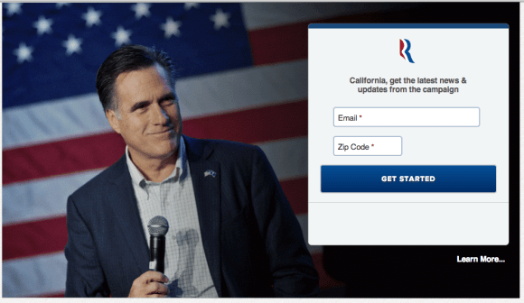
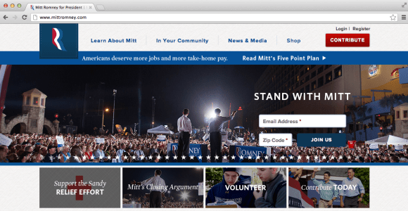
2. By clicking on Learn More… the user is taken to the full site:

Image

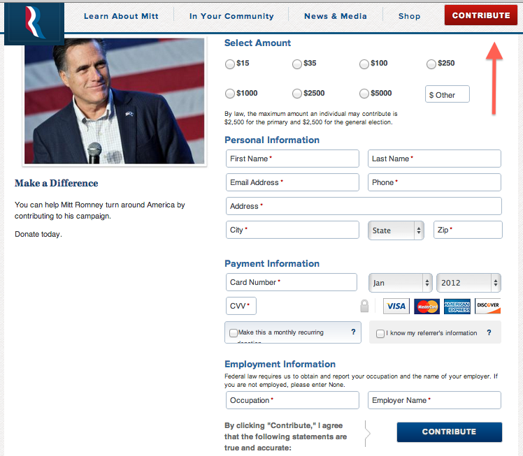
3. By clicking on the Contribute button in the top right, the user enters the donation flow:

Image

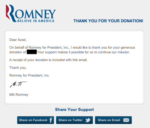
4. After specifying the donation amount, personal information, and payment information, the user is taken to the Thank You page:

Image

5. Here is what the confirmation email title and subject looks like in the Gmail Inbox:

Image

6. Finally, here is the content of the confirmation email:

Image

Now, let’s take a look at the incumbent, Barack Obama.

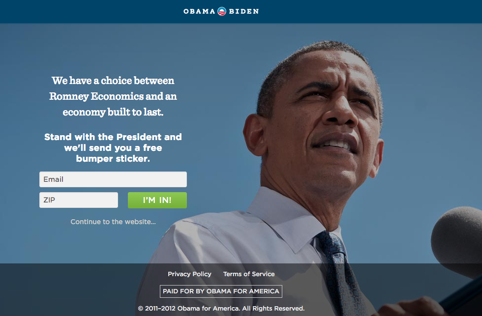
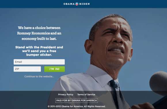
1. On going to http://www.barackobama.com, the user is redirected to an interstitial page and is asked to enter an email and zip code:

Image

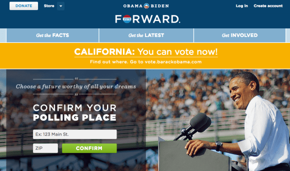
2. By clicking on Continue to the website… the user is taken to the full site:

Image

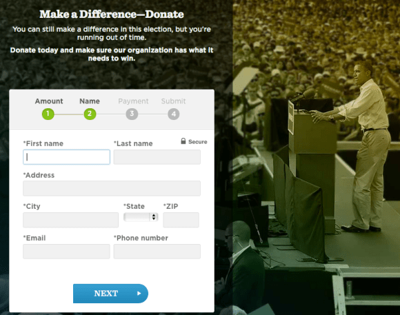
3. By clicking on the Donate button in the top left, the user enters the donation flow:

Image

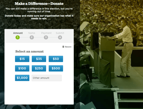
4. After specifying the amount, the user is taken to the next step to enter personal information:

Image

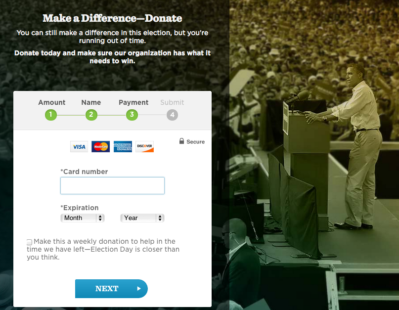
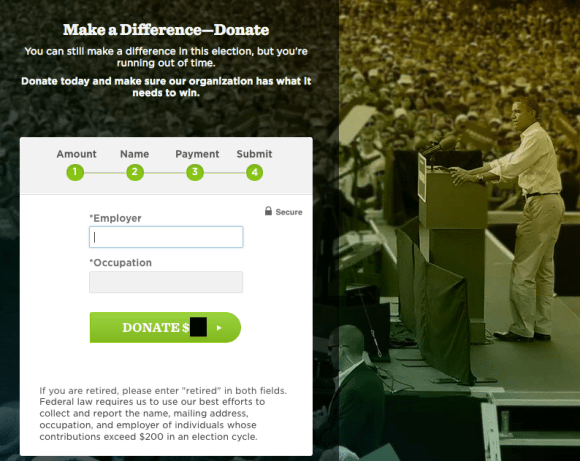
5. Next is the payment information:

Image

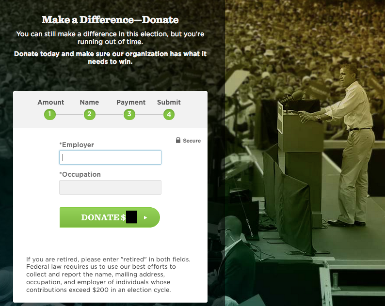
6. Next is the payment submission page:

Image

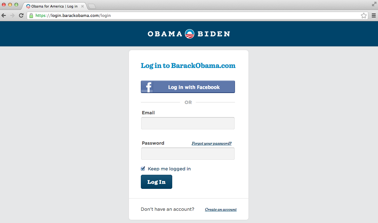
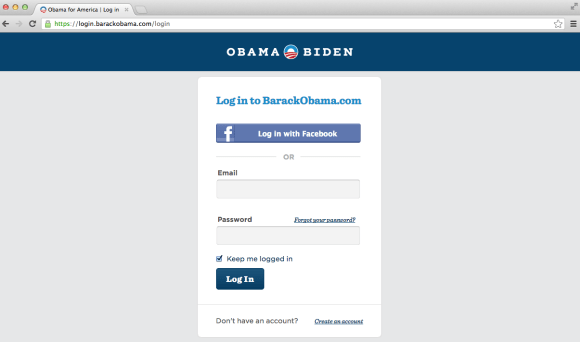
7. At this point, the user is taken to a login (?!) page:

Image

8. Here is what the confirmation email title and subject looks like in the Gmail Inbox:

Image

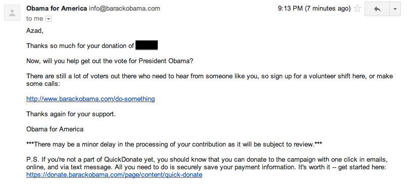
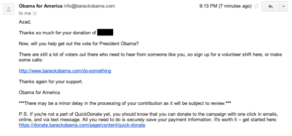
9. Finally, here is the content of the confirmation email:

Image

Thoughts on the two experiences…

1. Both campaigns make use of an interstitial page when the user first visits their website. The advantage of doing something like this is to instantly capture the user’s email address in order to send them a steady stream of marketing material. The disadvantage is that such an interstitial page is a source of friction and may lead to user drop-off — for example, a certain percentage of users would be expecting to immediately enter the donation flow and may drop-off the flow entirely if they are served with an interstitial instead of the real home page with a donation button option.

2. The Romney donation flow is completely captured on one page, and the Obama donation flow is 4 separate sub-pages. One could argue the Romney method is better due to the minimization of the total number of steps. On the other hand, one could argue the Obama method is better due to a simplification of capturing each essential component step-by-step. No clear winner here.

3. The Obama donation flow is lacking a donation confirmation step. This is a huge miss on their part. For Romney, the user clearly knows that they have completed the flow and that their donation has been submitted. In the Obama donation flow, the user is taken to a login page. That is just very odd. At the very least, the user should be shown some content thanking the user for the donation or confirming that the donation has been processed. Taking the user directly to a login page almost seems like a fluke or a bug.

4. In terms of how the email looks once it lands inside the Gmail Inbox, the Romney campaign is lacking. Their confirmation email is sent from an account named digital whereas the Obama confirmation email is sent from an account named Obama for America. Clearly, it is more reassuring for a donor to see the Obama email in their inbox than the Romney email.

5. In terms of the content of the email, the edge has to go to Romney. Team Obama may have been making a judgement call that many email clients (such as Gmail or Outlook) would strip out images in an HTML rich email so they went ahead with a plain text email. Romney, on the other hand, is using an HTML rich email with some social buttons to share the message forward. In addition, the Romney email is signed by Mitt Romney but the Obama email is only signed by Obama for America. Obviously, it’s not the real Romney doing the signing here, but it’s still a more personal touch.

All in all, it is rather remarkable to me both of these donation flows lack a certain amount of polish considering the fact that hundreds of millions, if not several billions, of dollars was spent by each respective campaign on this election.

Safari, Google, and Browser Search

Noticed an interesting change from Safari 5 to Safari 6 in OS X. In the Safari 5 header, there are two text entry modules: one for the URL, and another for a search query.

Image

In the upgrade to Safari 6, the two separate fields have been combined into one that serves as both the URL entry as well as the search module:

Image

Some things that come to mind:

1. Looking back at the history of the internet over the last 20 years, there was a moment where Search got really big. What I mean by this is we reached a point where the majority of users who came to the internet initiated their session by searching for something. Very recently, say in the last 3 years, with the boom of mobile apps, there has been a shift away from search as the starting post and more toward apps as the starting post for the user. What I found interesting is that this browser change pushes the user just slightly back toward the direction of search as a starting point.

2. Apple vs. Google. It’s an open secret that Steve Jobs was not particularly fond of Google toward the tail end of his time at Apple. While initially Apple and Google had some partnerships i.e. Google Maps and YouTube being two of the very first native apps on the iPhone, the relationship between the two companies went sour with the heavy investment of Google into Android. Just recently Apple has received a lot of negative attention by creating their own version of Maps for iOS instead of using the already beloved Google Maps app. So in this angle, it is very strange to see Safari, an Apple product, make it much easier for the user to use Google.

3. Web vs. Mobile. While this change has been incorporated into the web version of Safari, the iOS version of Safari remains the same with two separate fields. This is interesting for two reasons: (1) Apple has created an inconsistent user experience across different platforms OS X vs. iOS and (2) It is strange to see two separate fields in the UX for the platform with extremely limited screen real estate. If anything, one could make the case that there’s more justification in the web flow to have two separate entry fields due to an incredibly wider screen than a mobile view which has a much smaller screen width.

Image

Google Voice Verification Email Is Not Clear

Google Voice is a service from Google that gives users a phone number that’s not necessarily tied to one particular phone (or piece of hardware in general). Today, I got the following email from Google notifying me that some action is required by me to keep my account up and running:

Image

What got my attention about this email is that the next steps I had to take in order to verify my account were not entirely clear to me. Consider the following passage:

If you’d like Google Voice to continue forwarding calls and texts to this forwarding number, you will need to verify it by November 21, 2012. If you no longer own this phone number, please remove it from your account at https://www.google.com/voice#phones.

While it’s perfectly clear where I should go to if I wanted to remove the number (the link shown above), I have no idea where to go if I wanted to continue using the number. In the ideal user experience, the user will either see:

– In order to verify your account, go to <link1>. In order to stop using this number go to <link2>.
OR
– In order to verify your account or to stop using this number, go to <link3>.

OpenTable Null Search Can Be Improved

In an earlier post, I wrote about null search results as they pertain to a couple of news sites. Today, I noticed a sub-optimal user experience in the OpenTable iPhone app when I searched for a restaurant that was not found. Here is what I saw:

Image

While it does make sense, to a point, that restaurants that are not part of the OpenTable network be omitted from the search results, this is certainly a missed opportunity and can be improved. Before outlining a different user experience, lets take a quick look at what the Yelp app shows for this restaurant:

Image

Image

In the Yelp search results, we are able to find the restaurant we’re looking for along with a list of other restaurants that are similar. Furthermore, in the Yelp restaurant page, we see some important pieces of information pertaining to the restaurant. And this leads us back to how OpenTable can improve their user experience.

At the very least, they should have a record of the restaurant and some important information pertaining to the restaurant i.e. address and phone number. With the phone number, the user will have the option to Call (similar to Yelp above) and get in direct contact with the restaurant in order to make the reservation.

Looking beyond the restaurant information, another feature that may be beneficial is to add a list of several restaurants (that are in the OpenTable network!) that would be suggested to the user instead. With the current user experience, the user is stuck, can’t make progress with the restaurant they’re looking for, nor are they pointed toward the direction of another comparable restaurant.

Facebook iOS Ads May Span Entire Screen

Much has been said about how important it is for Facebook to successfully monetize in the mobile space. Advertising in an app is a double-edged sword that yields seemingly free money on the one side but may lead to long-term disengagement from users. At the end of the day, deciding on the amount of advertising in an app requires a very delicate balance to be maintained.

Today, I saw something in the Facebook iOS app that was definitely not balanced:

Image

In my opinion, this experience as bad for the end user for two reasons:

  1. The entire screen of the user’s view is taken up by ads
  2. This was the first thing that was shown upon entry into the app

In an ideal user experience, there would be some smarter logic that would spread out ads across the different news feed stories so that the user is never bombarded with so many ads at once that they don’t get anything resembling what they were looking for in the first place.

iOS 6 Bug: Assistive Touch + Multitasking View + Siri Doesn’t Work

Assistive touch is a feature in iOS that lets you enter multi-touch gestures using just one finger. This feature is off by default and can be enabled via the iOS settings. Here is what assistive touch looks like in the iPhone:

Image


Recently, I discovered a bug with assistive touch that does not let the user get to Siri from the assistive touch menu while simultaneously in the “multi-tasking” view. Here are the steps to reproduce the bug:

1. Double click the iPhone home button in order to enter the multi-tasking view

Image

2. Touch the assistive touch icon on the screen in order to also enter the assistive touch view

Image

3. Touch the Siri option

Actual results:

Nothing happens – user is not shown Siri. User sees same screen as step (1) above. 

Expected results:

User is shown Siri 

Image


An Enhancement to iOS Image Sharing Within Text Messages

One thing I like to do on my iPhone is to take an image which is sent to me via MMS (basically text messaging but for images or videos A.K.A. “multi-media messaging service”) and send it to another friend. I recently noticed that the process to do this rather simple exercise can be improved. Here is an example of an image that is sent via MMS:

Image

By clicking on the top right menu, I see the various options available:

Image

What’s interesting is that there is no option here to forward this image via MMS to another user in my address book. What I end up doing is selecting the option Save to Camera Roll and then going to my camera roll to select the image:

Image

By selecting the menu button in the bottom left corner of the screen, the user is shown the following options:

Image

As can be seen above, the MMS option is available only after saving a local copy of the image to my camera roll. Ideally, this should not be a prerequisite and the OS should have the ability to let me send an MMS of the image directly from the text message view I was previously inside of. Worst case scenario, the OS can keep a local copy of the image and then delete it after the message is sent. By requiring this extra step, the end-to-end process has become more challenging.

LinkedIn Glitch Counts Nonexistent Messages

Over the last couple of months, I’ve seen something very annoying and incorrect in my LinkedIn account. On logging in and going to my home landing page, I saw that I had two messages in the header icon:

Image

After clicking on the icon, I was taken to the Messages Inbox:

Image

So apparently LinkedIn thinks that there are two messages in my inbox, but they are nowhere to be found! This is quite annoying as I will never have an accurate read as to how many messages are in my inbox and what needs my attention.

A Couple of Improvements to the Apple Online Store

I recently got a new iPhone 5. One of the things that’s important for me is to have a backup charger at my work in addition to the charger I keep at home. Naturally, I went to Apple.com to search for this item. Through this process, I noticed two specific spots for improvement. 

First thing I did was to click on the Store link in the header menu and to search for iphone charger. To my surprise, these were the search results:

Image

Only three items were returned, and none of them was the main charger that Apple sells for the iPhone 5. What gives? After further searching on the site, I realized that the reason why I couldn’t find the item I was looking for was because I was using the wrong search terms. According to Apple, the items I am looking for are referred to as:

– Apple 5W US Power Adapter (this is the plug portion of the charger)
– Lightning to 30-pin Adapter (this is the USB cable portion of the charger)

If Apple’s Store search was a bit smarter, it would be able to determine that a query for iphone charger should show the products called out above. 

The second improvement I’ll call out is something I noticed when I finally found the items I was looking for. They were located listed in the iphone accessories section on the site. Here’s what they look like: 

Image


So the thing that is strange about how these items appear in the search results is just how challenging it is to discern what the photograph looks like. Why? Since many of these Apple products are white themselves in color, the contrast between the product’s color and the white background of the website is virtually nonexistent. Thus, as a user it is very hard to make out what these products look like. As an enhancement, Apple.com can consider changing the background color from something other than pure white. Perhaps off white or gray can work.