iOS Bug: Cannot Delete Contact From “Favorites” View

Noticed some interesting behavior related to iPhone contacts. While viewing a particular contact details as initiated from the “Favorites” section, it is not possible to delete the contact. However, while viewing the same contact from the main contact list, it is possible to delete the contact. 

Let’s start with the typical use case. Start with a contact who is on your list of Favorites. Click on the Contacts icon and search for this contact amongst all contacts. Click on the contact to view details. Note the highlighted “Contacts” icon toward the bottom center of the image below:

Image

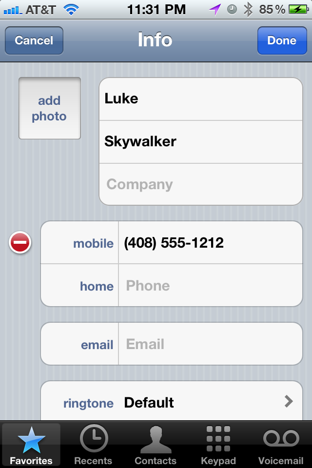
Click on the edit button in the top right corner to see this: 

Image

If you scroll all the way down, you will see the big red rectangular button to delete the contact:

Image

Let’s now look at this contact’s details from the Favorites view:

Image

Click on the arrow to see details:

Image

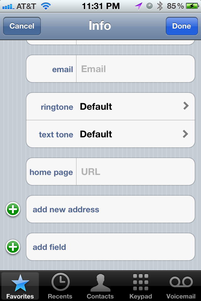
Click on edit to see:

Image

Scroll all the way to the bottom and you will NOT see the big red rectangular delete button!!

Image


Yahoo Finance iPhone Stocks App Has Irrelevant News Suggestions

I’ve noticed a lot of low quality results when looking at the news article feed for stocks in the Yahoo Finance iPhone Stocks App. It seems that for a given stock, for example eBay, the app is suggesting any article that even has a mention of eBay.

Recently, I’ve been noticing a lot of articles that are relevant for Yahoo Inc., but not eBay. The reason is fairly obvious: the current CEO of Yahoo Inc., used to be an employee of eBay Inc. As such, many online articles about Yahoo point out the fact that Scott Thompson used to work for eBay.

That being said, the App can be a little smarter in deciding which articles to show. For example, it can analyze the click through rate of a given article that shows up both for eBay and Yahoo — and most likely for these types of articles, users viewing the Yahoo ticker symbol are going to be more likely to click through on the article as it’s more relevant to them. Once that occurs, the same articles should move down the search rankings when they are in the eBay stock ticker news view.

Imagee

A New Feature for the iPhone Clock Alarm

Just like the majority of working folks, I use an alarm to wake up every morning Monday through Friday. And just like a huge chunk of those folks, I use the iPhone clock alarm to get my attention and summon me out of bed. There is one aspect of this daily routine that is unnecessarily annoying.

Let’s say I have two alarms. The second one scheduled as a back-up in case the first one doesn’t wake me up. Or in case I wake up and (in an act of self-sabotage) I instinctively turn off the first alarm and go back to bed.

Similar to many people out there, my body has trained itself to wake up 5 or 10 minutes right before my initial alarm goes up. Basically, it’s gotten used to the routine so it just wakes up itself -instead of being prompted. So at this point, I’m awake and ready to get ready for work. But, I have two active alarms that haven’t been triggered yet. If I do nothing to the alarms and go and take a shower, the phone will start to make it’s LOUD alarm sounds while I’m gone. This could be a distraction and an annoyance to anyone nearby who is (lucky for them!) still sleeping. So why don’t I just turn OFF the alarms? Well, because if I turn them off, then I have to turn them on again every day to be prepared for the next day. This completely defeats the purpose of having a recurring alarm notification.

I propose a new feature. We can call it a one-time-snooze, or a one-time-OFF, or maybe we can come up with the name later. But how it would work would be: for a given alarm notification, the user can request that the application forgo the immediate upcoming alarm reminder. That way, I can go off and get ready, the phone will not sound an alarm for the morning, but it will be ready to do so the next morning!

Yelp User Photos: Mobile vs. Web

As mobile/tablet user experiences become more widely used versus their (archeological) non-mobile/tablet web counterparts, there may be a divergence of functionality for the same feature on the same site for the different platforms.

Consider Yelp user profiles and the corresponding user photos. In the iPhone Yelp App, I can browse to the user’s profile page and view all of their photos without being a Yelp member:

Image

However, when I try to do the same on my laptop, I see the following:

Image

Image

Here, Yelp is asking me to log into my account, or register as a new user in order to view this user’s photos. Not sure if Yelp is making this distinction between iPhone and WebApp on purpose or if this is a bug, but let’s assume it’s on purpose. They may be making the bet that users are more willing to register and/or login in the non-mobile web flow as compared to the iPhone App flow. Why? Most likely, the user has a keyboard in front of them and can get to the next step more quickly than using their touchscreen device to login or worse, register for a new site. It’s an interesting strategy, but one that will may yield a drop-off in logins or registrations as users flock from their computers to smart phones and tablets.

A (rare) Complaint About the iPhone

One surprising “feature”, for me, about the iPhone is that a password character is visibly displayed for a short amount of time before being hidden. The motivation behind this feature being that people are less used to typing passwords into mobile touchscreen devices. And since these passwords need to be 100% accurate (and there’s no nifty iOS auto-correct to save the day), the user is given assistance by showing, for a brief period of time, what they typed in. 

Here’s an example:

Image

I understand the motivation behind this functionality. What I don’t get is why there isn’t an option in the user settings in order to override this type of behavior. If I am willing to forego the extra added convenience of being able to type in the password and willing to trade it for the extra added security for someone looking over my shoulder, why shouldn’t I have this choice? 

The funny thing is that Apple itself doesn’t follow this pattern with respect to the iPhone unlock view. The numerical inputs are always hidden and never briefly lag on the screen for anyone to see:

Image