Safari, Google, and Browser Search

Noticed an interesting change from Safari 5 to Safari 6 in OS X. In the Safari 5 header, there are two text entry modules: one for the URL, and another for a search query.

Image

In the upgrade to Safari 6, the two separate fields have been combined into one that serves as both the URL entry as well as the search module:

Image

Some things that come to mind:

1. Looking back at the history of the internet over the last 20 years, there was a moment where Search got really big. What I mean by this is we reached a point where the majority of users who came to the internet initiated their session by searching for something. Very recently, say in the last 3 years, with the boom of mobile apps, there has been a shift away from search as the starting post and more toward apps as the starting post for the user. What I found interesting is that this browser change pushes the user just slightly back toward the direction of search as a starting point.

2. Apple vs. Google. It’s an open secret that Steve Jobs was not particularly fond of Google toward the tail end of his time at Apple. While initially Apple and Google had some partnerships i.e. Google Maps and YouTube being two of the very first native apps on the iPhone, the relationship between the two companies went sour with the heavy investment of Google into Android. Just recently Apple has received a lot of negative attention by creating their own version of Maps for iOS instead of using the already beloved Google Maps app. So in this angle, it is very strange to see Safari, an Apple product, make it much easier for the user to use Google.

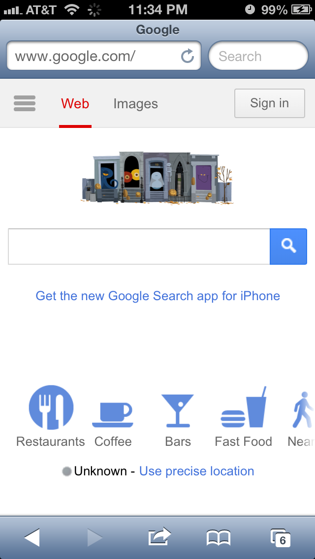
3. Web vs. Mobile. While this change has been incorporated into the web version of Safari, the iOS version of Safari remains the same with two separate fields. This is interesting for two reasons: (1) Apple has created an inconsistent user experience across different platforms OS X vs. iOS and (2) It is strange to see two separate fields in the UX for the platform with extremely limited screen real estate. If anything, one could make the case that there’s more justification in the web flow to have two separate entry fields due to an incredibly wider screen than a mobile view which has a much smaller screen width.

Image

Advertisement

Facebook iOS Ads May Span Entire Screen

Much has been said about how important it is for Facebook to successfully monetize in the mobile space. Advertising in an app is a double-edged sword that yields seemingly free money on the one side but may lead to long-term disengagement from users. At the end of the day, deciding on the amount of advertising in an app requires a very delicate balance to be maintained.

Today, I saw something in the Facebook iOS app that was definitely not balanced:

Image

In my opinion, this experience as bad for the end user for two reasons:

  1. The entire screen of the user’s view is taken up by ads
  2. This was the first thing that was shown upon entry into the app

In an ideal user experience, there would be some smarter logic that would spread out ads across the different news feed stories so that the user is never bombarded with so many ads at once that they don’t get anything resembling what they were looking for in the first place.

iOS 6 Bug: Assistive Touch + Multitasking View + Siri Doesn’t Work

Assistive touch is a feature in iOS that lets you enter multi-touch gestures using just one finger. This feature is off by default and can be enabled via the iOS settings. Here is what assistive touch looks like in the iPhone:

Image


Recently, I discovered a bug with assistive touch that does not let the user get to Siri from the assistive touch menu while simultaneously in the “multi-tasking” view. Here are the steps to reproduce the bug:

1. Double click the iPhone home button in order to enter the multi-tasking view

Image

2. Touch the assistive touch icon on the screen in order to also enter the assistive touch view

Image

3. Touch the Siri option

Actual results:

Nothing happens – user is not shown Siri. User sees same screen as step (1) above. 

Expected results:

User is shown Siri 

Image


An Enhancement to iOS Image Sharing Within Text Messages

One thing I like to do on my iPhone is to take an image which is sent to me via MMS (basically text messaging but for images or videos A.K.A. “multi-media messaging service”) and send it to another friend. I recently noticed that the process to do this rather simple exercise can be improved. Here is an example of an image that is sent via MMS:

Image

By clicking on the top right menu, I see the various options available:

Image

What’s interesting is that there is no option here to forward this image via MMS to another user in my address book. What I end up doing is selecting the option Save to Camera Roll and then going to my camera roll to select the image:

Image

By selecting the menu button in the bottom left corner of the screen, the user is shown the following options:

Image

As can be seen above, the MMS option is available only after saving a local copy of the image to my camera roll. Ideally, this should not be a prerequisite and the OS should have the ability to let me send an MMS of the image directly from the text message view I was previously inside of. Worst case scenario, the OS can keep a local copy of the image and then delete it after the message is sent. By requiring this extra step, the end-to-end process has become more challenging.

An Enhancement to the iOS Low Battery Warning

As an iPhone user, one common user activity is to watch a video. While you’re watching a video, there are very few things that could occur that would justify the phone stopping the video and grabbing your attention. An example of something that would justify stopping the video would be an incoming phone call. 

I noticed an example where I did not appreciate the phone stopping the video. This occurs when the phone is running low on battery. If the phone reaches 20% or 10%, you will see a dialog alert like this and your video will stop mid-stream: 

Image

I do recognize that it is important for the OS to get the user’s attention for this use case, but I think there’s a better way of doing this. To explore a better way of doing this, we can look no further than the iOS update to how text messages are treated. Previously, text messages in iOS, would be shown as a dialog alert just like above: 

Image

As of iOS 4.0 (or was it 5.0?), text message alerts are not as intrusive and can float to the top of the page: 

Image

So the idea for this enhancement would be the same. If the user is watching a video, simply show them an alert but have it exist in the background with a dismiss button. This way, the user can continue to watch the video without being interrupted and know that their iPhone is about to run out of battery. 

Google and the Future of Maps on the iPhone

According to recent press reports, Apple may replace the Google Maps app on the iPhone with their own in-house Maps app. While this came as a surprise to me (Google Maps was one of the earliest apps on the iPhone and one of my most used apps), I’m eager to see how Apple can improve from the Google product. 

Recently, I noticed a use case for which I was annoyed with Google Maps, and this could be taken as an example of a room for improvement for any competing product. 

I was on the Caltrain going from Sunnyvale to San Mateo to meet a friend for dinner. Along the ride, I was curious to see how much distance (and time) remained ahead in my journey. So I pulled out my trusty iPhone, went to Google Maps, and searched for San Mateo, CA. What I wanted to do was to find the city and have the app calculate the distance (and time) remaining from my current location. My expectation was for the app to find the city and to serve up the city as a pin for me to touch and then go to the next level of calls to action. Google Maps found the city for me, but instead of serving up the city pin as the main call to action, I was shown the following: 

Image

As can be seen in the image above, the primary pin shown to me was a sponsored result of a dentist near San Mateo. I had to manually touch the San Mateo city pin in order to toggle from the sponsored result to the desired result:  

Image

This example reminded me of Google’s famous motto, “Don’t Be Evil.” This motto means many different things to many different people. To me, it means that it is possible to make a business viable product while not drastically sacrificing the user experience for the purpose of generating revenue. Google Search (especially its earliest incarnations) was a great example of an extremely profitable product that kept a great balance with user experience. With the example above, I feel that for this product, Google crossed the line and sacrificed user experience a little too much in order to generate revenue. 

iOS Bug: Cannot Delete Contact From “Text Message” View

In an earlier post, I wrote about how a user cannot delete a contact on their iPhone if they edit the contact details while entering from the Favorites view. Today, I discovered that the same bug (feature?) also exists if you attempt to edit the contact details while entering from the Text Message view. 

Suppose you are text messaging with a friend:

Image

And if for whatever reason (say your friend is no longer responsive [insert sad face]) you want to delete this friend from your contact list. The logical thing to do would be to click on the Contact button to view and edit contact details. On click, you will see: 

Image

By clicking Edit, you will see: 

Image

And if you scroll down all the way – similar to the behavior of entering via the Favorites view, you will not see a Delete Contact button:

Image

iOS Bug: Cannot Delete Contact From “Favorites” View

Noticed some interesting behavior related to iPhone contacts. While viewing a particular contact details as initiated from the “Favorites” section, it is not possible to delete the contact. However, while viewing the same contact from the main contact list, it is possible to delete the contact. 

Let’s start with the typical use case. Start with a contact who is on your list of Favorites. Click on the Contacts icon and search for this contact amongst all contacts. Click on the contact to view details. Note the highlighted “Contacts” icon toward the bottom center of the image below:

Image

Click on the edit button in the top right corner to see this: 

Image

If you scroll all the way down, you will see the big red rectangular button to delete the contact:

Image

Let’s now look at this contact’s details from the Favorites view:

Image

Click on the arrow to see details:

Image

Click on edit to see:

Image

Scroll all the way to the bottom and you will NOT see the big red rectangular delete button!!

Image


iOS Update All Apps Bug (iOS Version 5.1)

Bug description: When going through the “Update All” flow in the iOS App Store, when the user hits the cancel key on the Apple ID login prompt, the user can no longer update their apps in flow. 

Steps to reproduce & actual results:

1. Go to the App Store when you have multiple Apps that need to be updated (note that this bug may also exist for the use case where only one app needs to be updated)
2. Click on the Update All button 

Image

3. On the Apple ID login screen, do not enter a password, and click cancel:

Image

4. You will be brought back to the previous page, BUT the Update All button has now been disabled. 

Image

Expected behavior: The Update All button should remain enabled.