
In the last month, I’ve seen so many different version of the Google +1 button that my head’s starting to spin. In terms of cultivating loyalty to a product, I don’t think it’s a good idea to constantly change the branding and how it looks to users. Let’s have a review of all of the different versions.
I’ll start with what I’ll call Version 0, as seen about a month ago on Google Finance:
Then, let’s move on to what I’ll call Versions 1 and 2 – which most people would call their current main versions. One place to find these versions is on the official Google +1 page located here.
One is a rectangular button with the “g” in the design. The body is red and the interior is white.
The other is a square button without the “g” in the design. The body is red and the interior is white.
First point of confusion: why are their two designs (one with the “g” and one without the “g”) ?!?

Now, let’s move to two places that currently have these two versions. First, we’ll start with Version 1 (with the “g”) that is currently being used in the Google Finance stock page:

Then we’ll move on to Google+ that is making use of the +1 button without the “g”:

But wait! There’s a key difference between how these two buttons are used in practice (in Google Finance & Google+) versus how they were branded in theory (the main Google +1 page). The color schemes are swapped. On the +1 main page, the interior is white and the body is red, whereas in Google Finance and Google+, the interior is red and the body is light gray. Why the color swap?!?
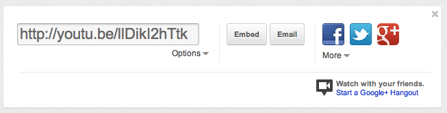
Now, onto more confusion. Here is what the +1 button looked like in the YouTube share module up until yesterday:

OK – simple enough – this was just the same as Version 1 (color swap) called out above. But wait, here is what the YouTube +1 looks like today:
So now we have a third version of this button which has the “g” and the “+” but no longer has the “1”.
Like I said before, my head is spinning. It’s best to stick to one version and ensure user consistency across multiple flows.
